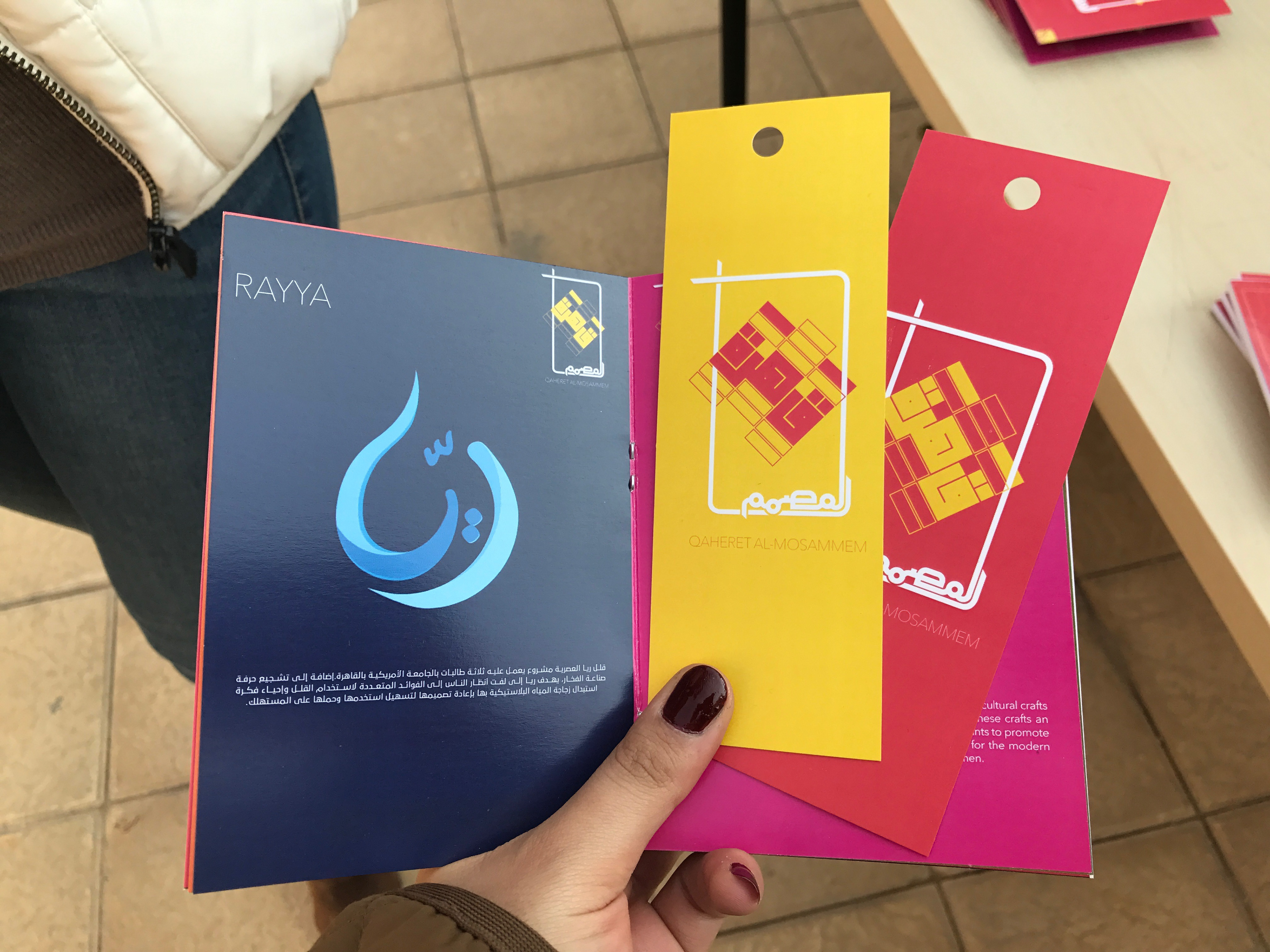
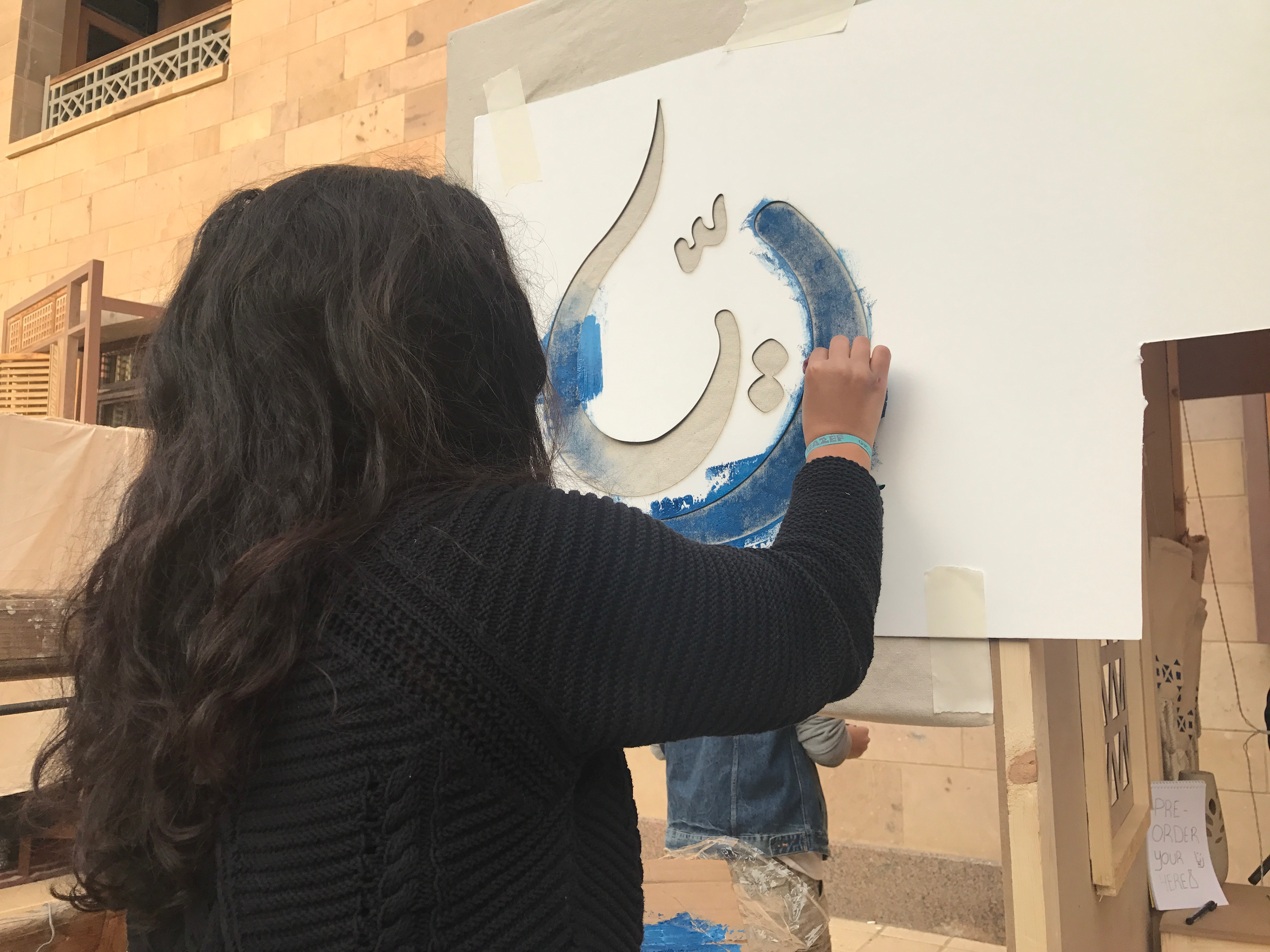
The logo was designed to look like a water droplet and the name "Rayya" in Arabic means to quench thirst.
The project's documentation was done in Arabic upon the instructor's request to reflect the identity of the artisanship's origins and characteristics.
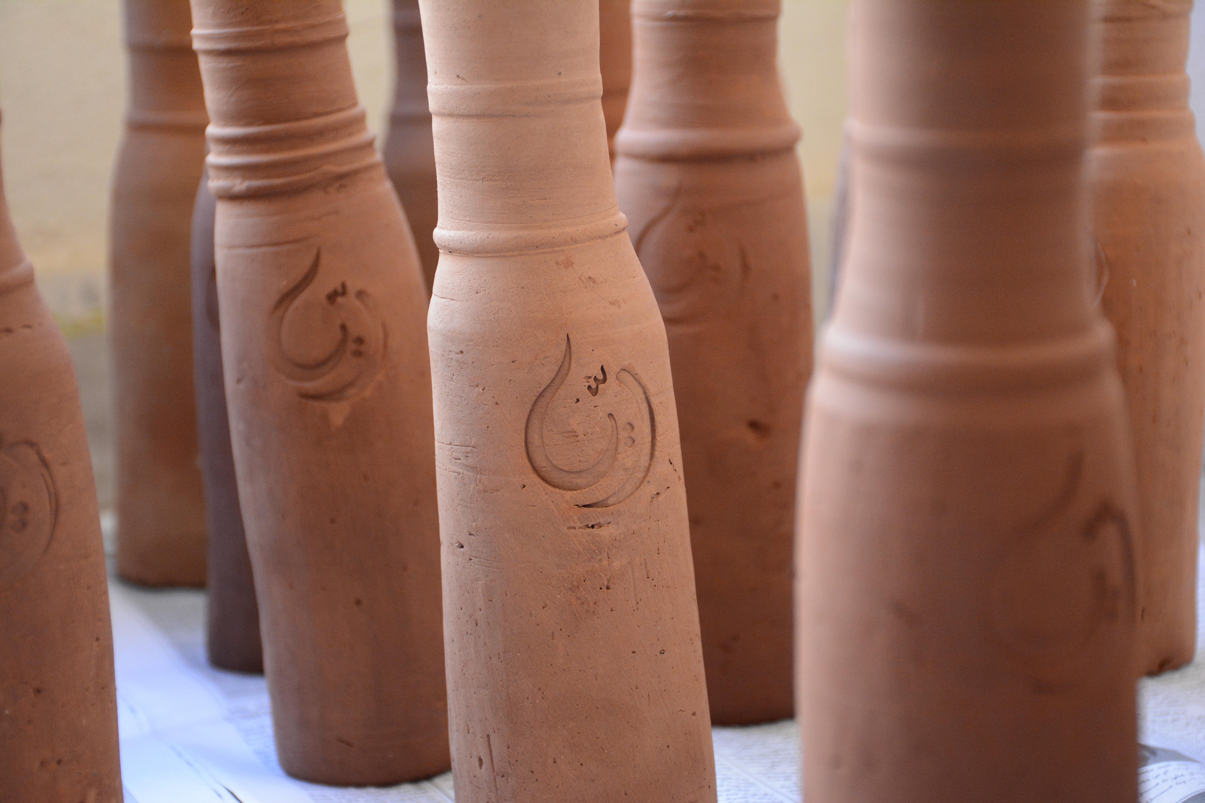
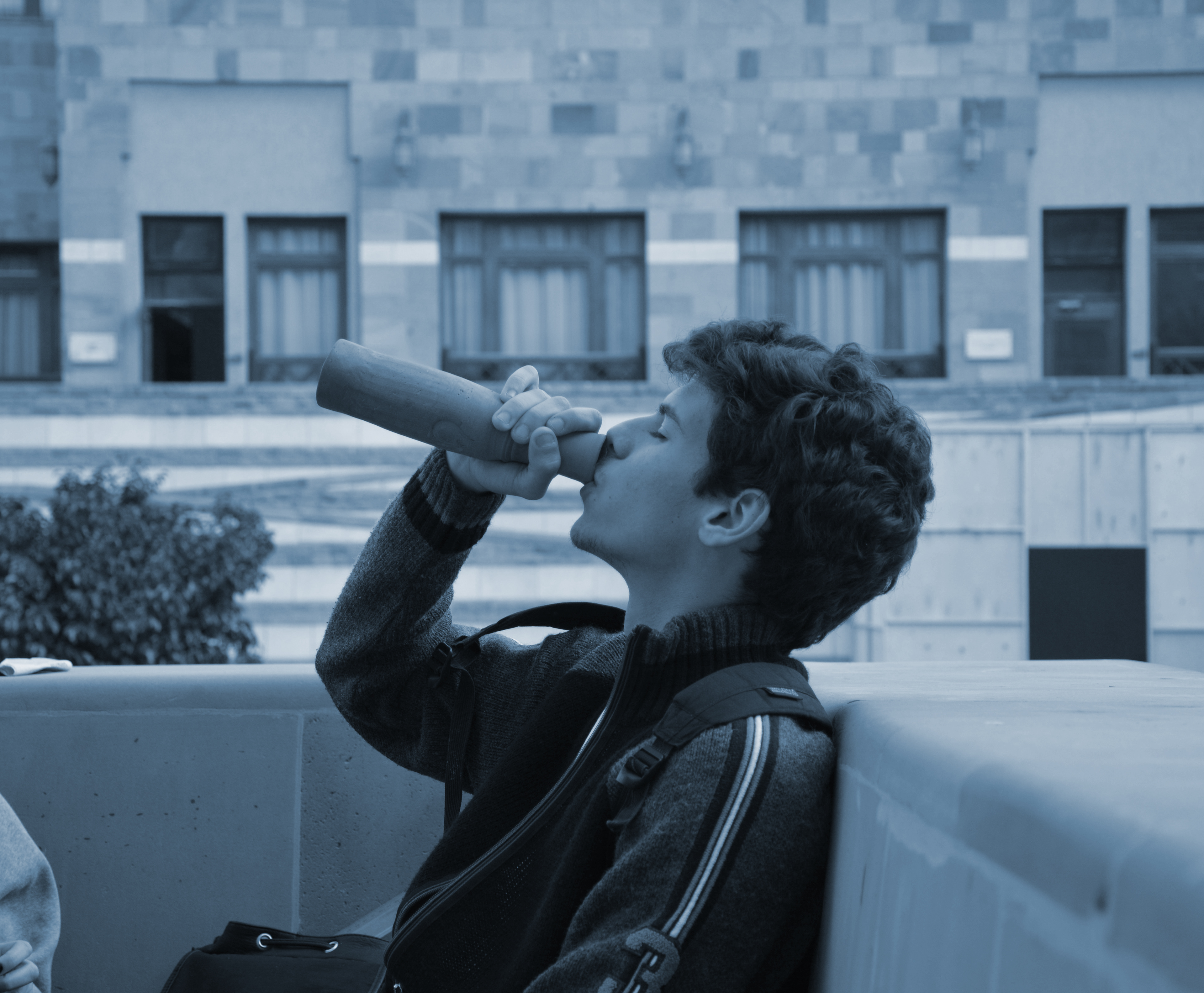
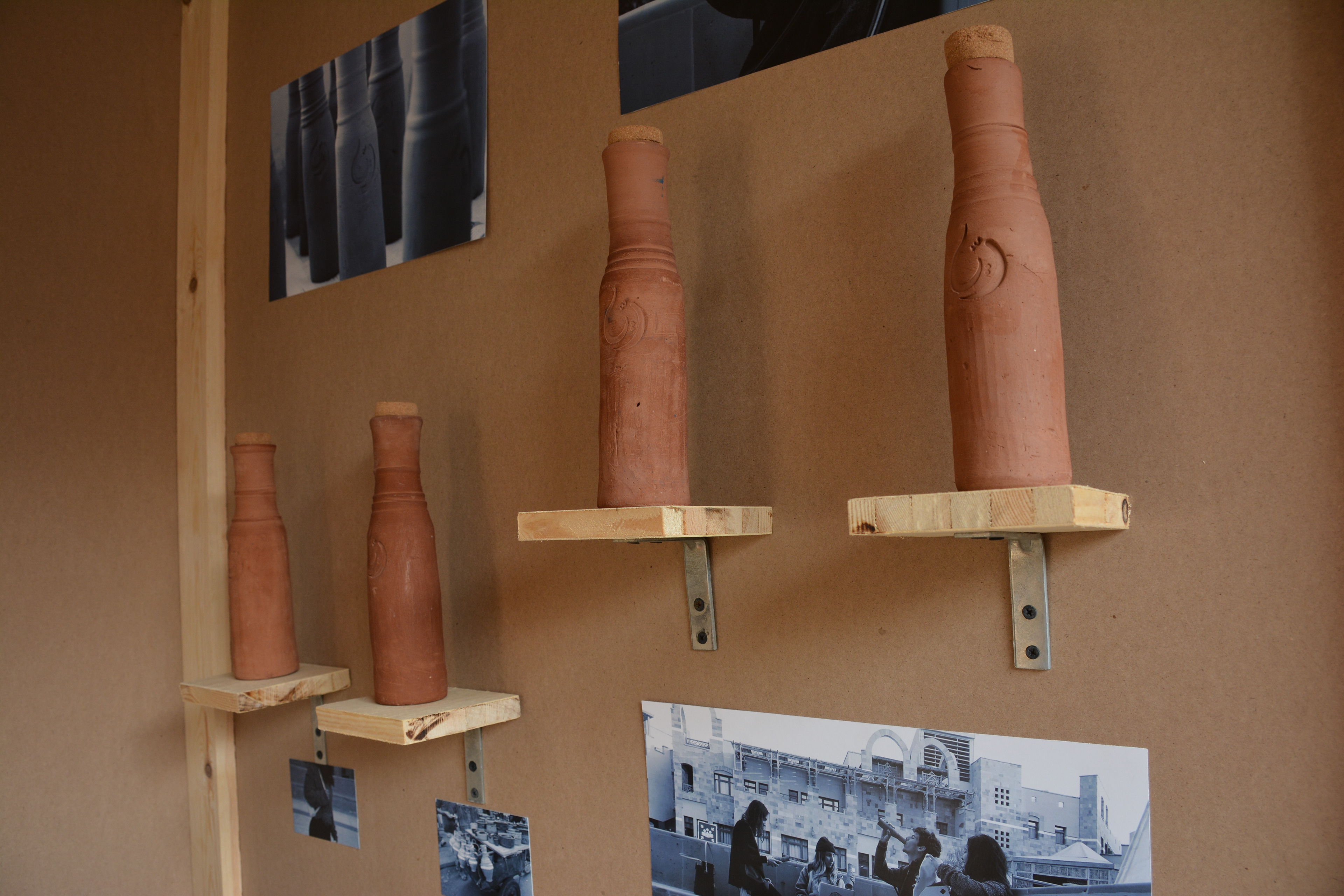
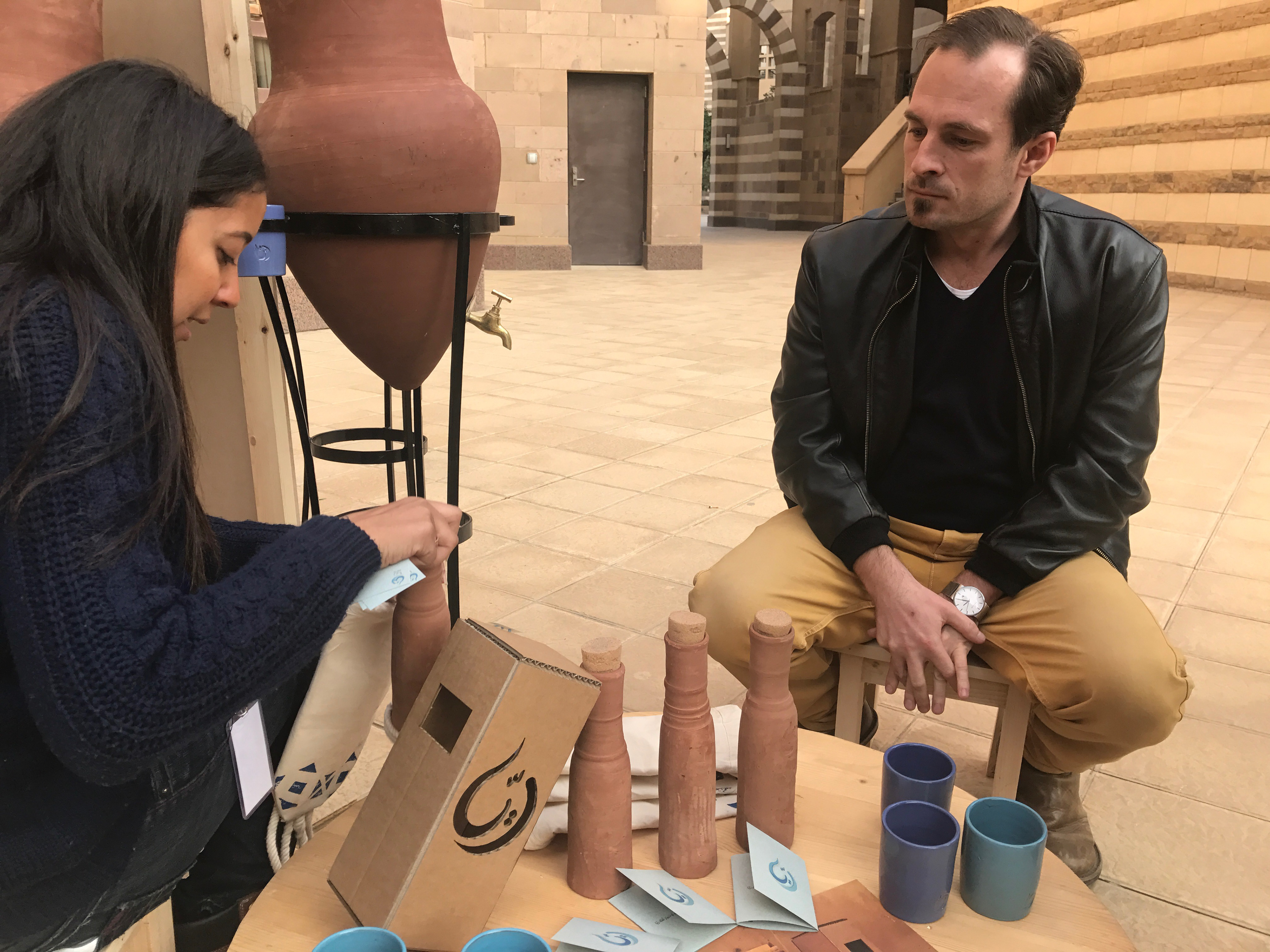
After thorough research to find the perfect potter and the design whose ergonomics fit a water bottle's, we mass produced these "olas" and stamped them with the logo.
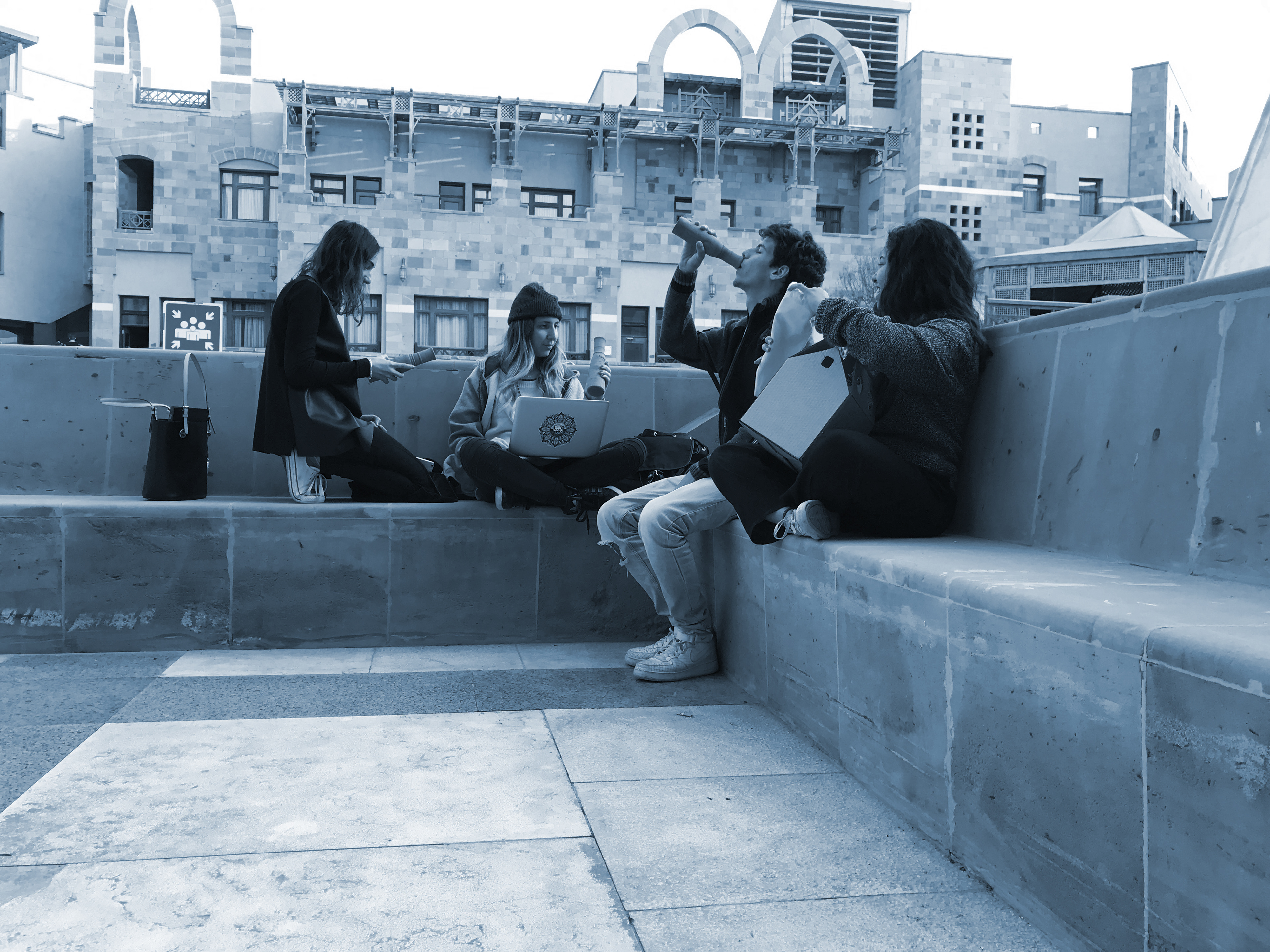
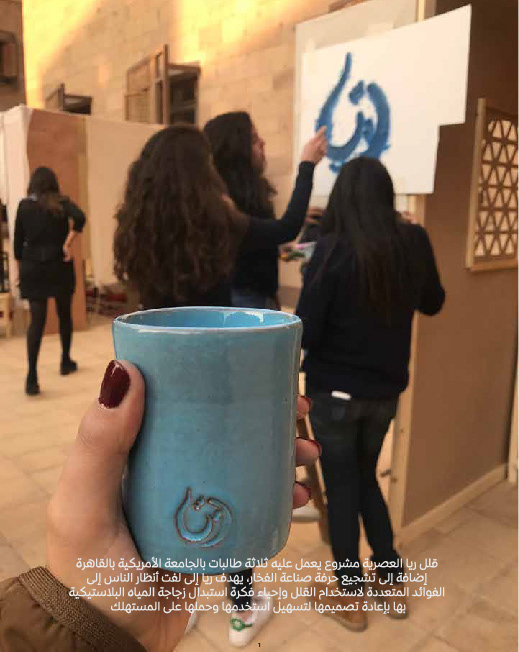
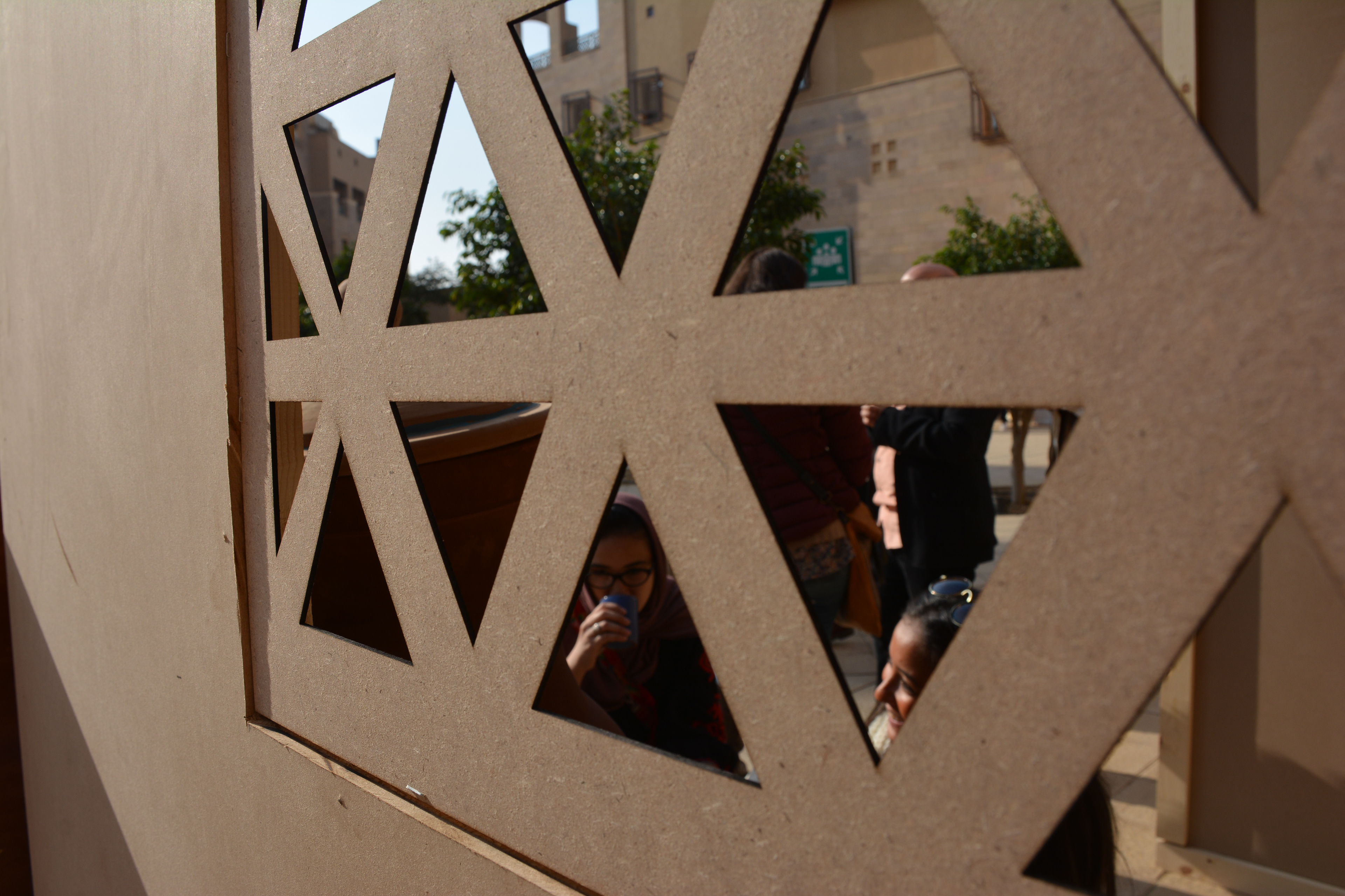
Rayya project was part of Qaherat al Mosammem (The Designer's Cairo) exhibition held at the AUC on the 21st & 22nd of December 2016, showcasing the work of students as they made a full retail experience for a product they innovated or reinvented from Egyptian and Arab culture.
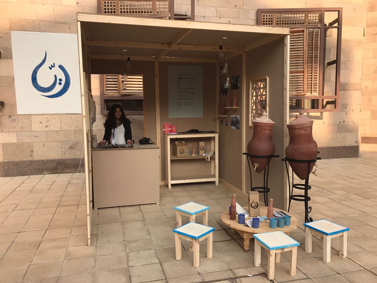
Rayya's retail shop
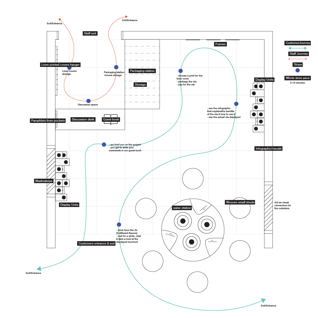
Rayya's retail shop preliminary plan with labels and visitors' journey.
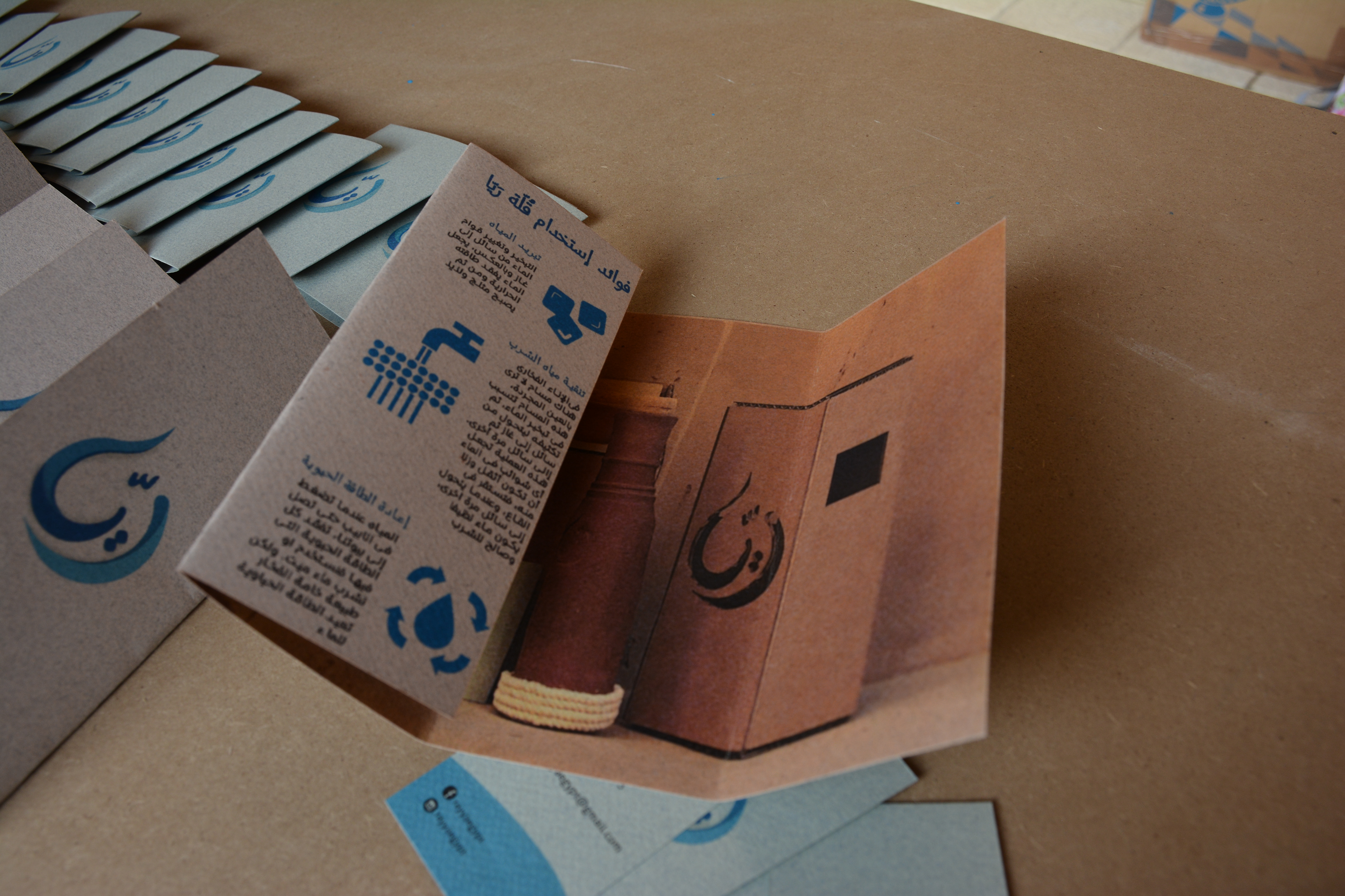
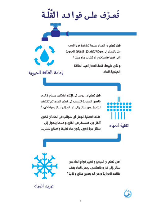
Pamphlets were assorted with the packaged product and brochures were handed out to visitors having each a detailed chart of the benefits of the "ola" and what Rayya is working on and aims to achieve.
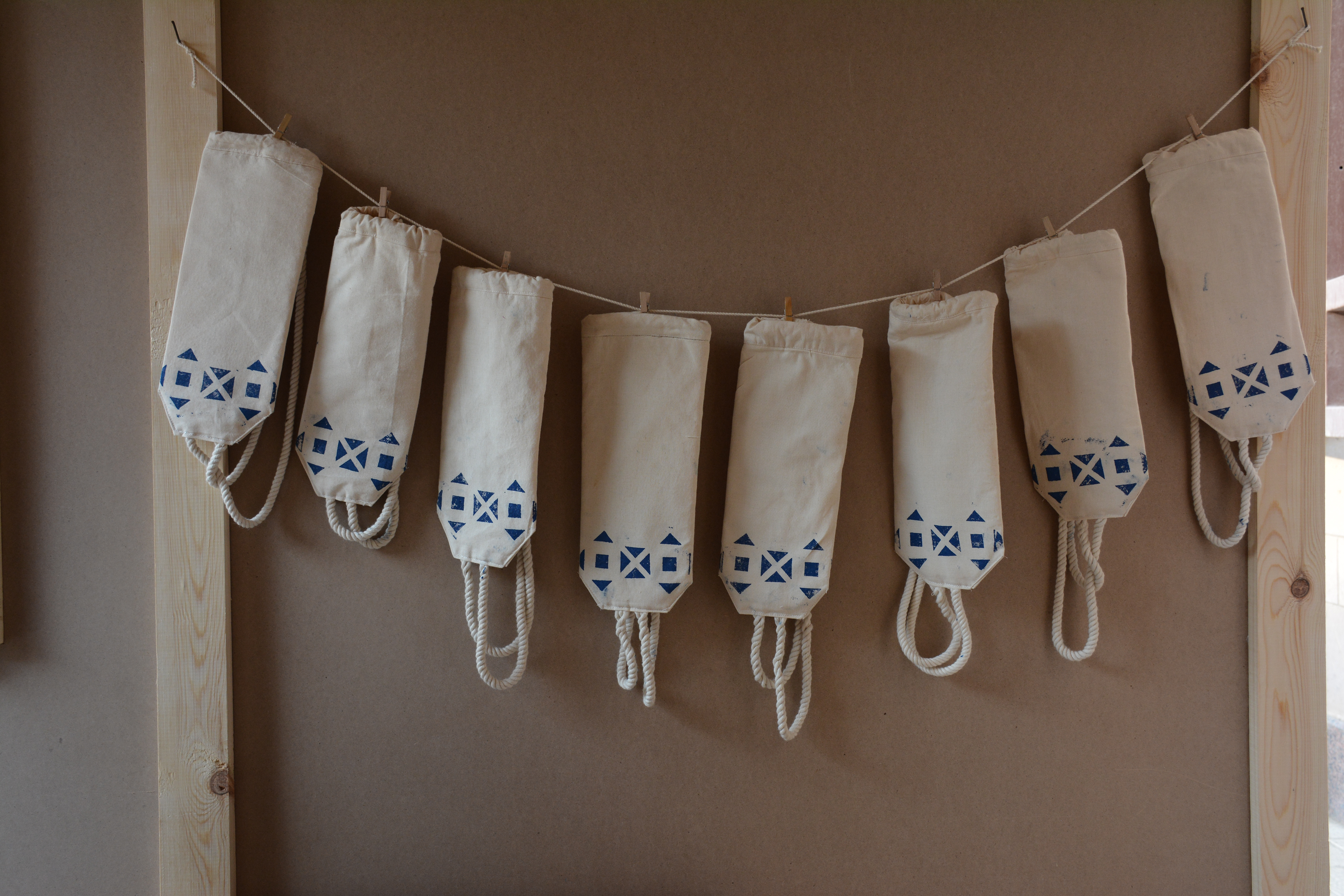
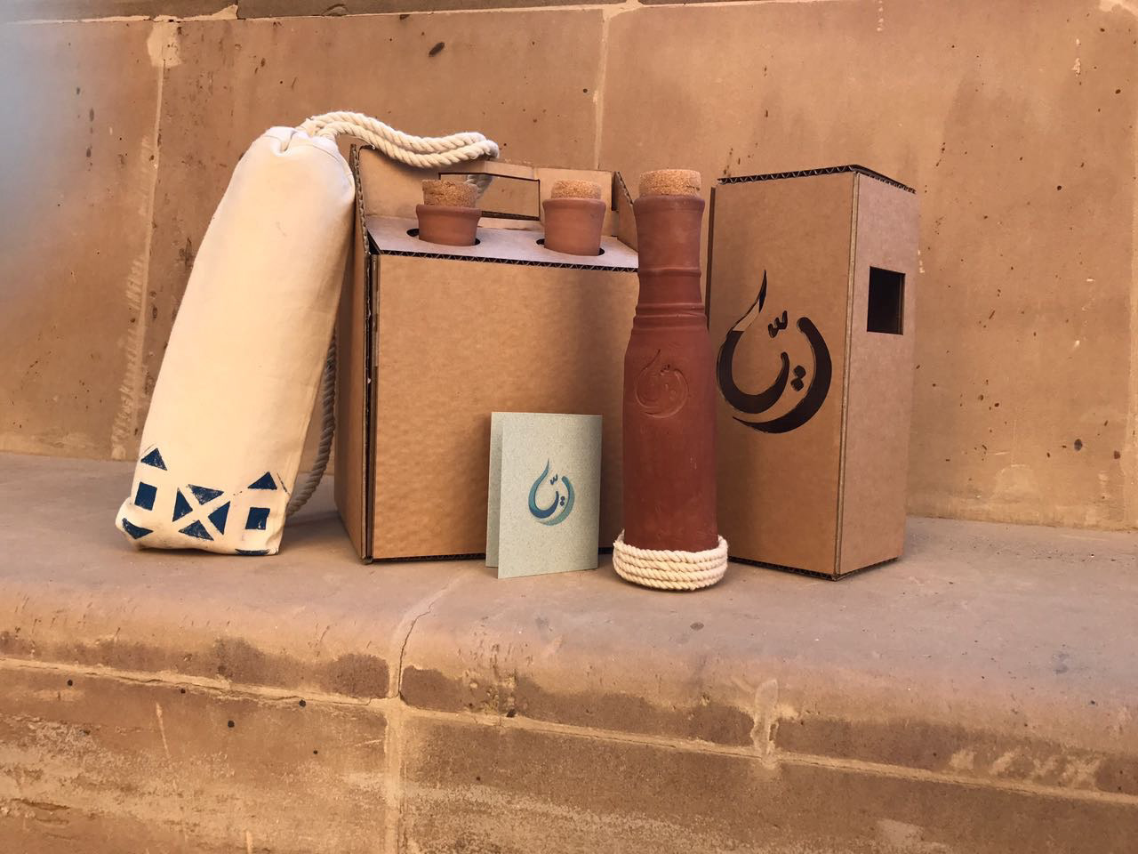
Packages are 100% handmade. They're sewn from eco-friendly materials--linen and loofa textile. They're easy to carry, padded from inside to protect the fragile "ola", and fit the ola's dimensions with enough space for closure. The prints are inspired from the Nubian houses, home of the craft.
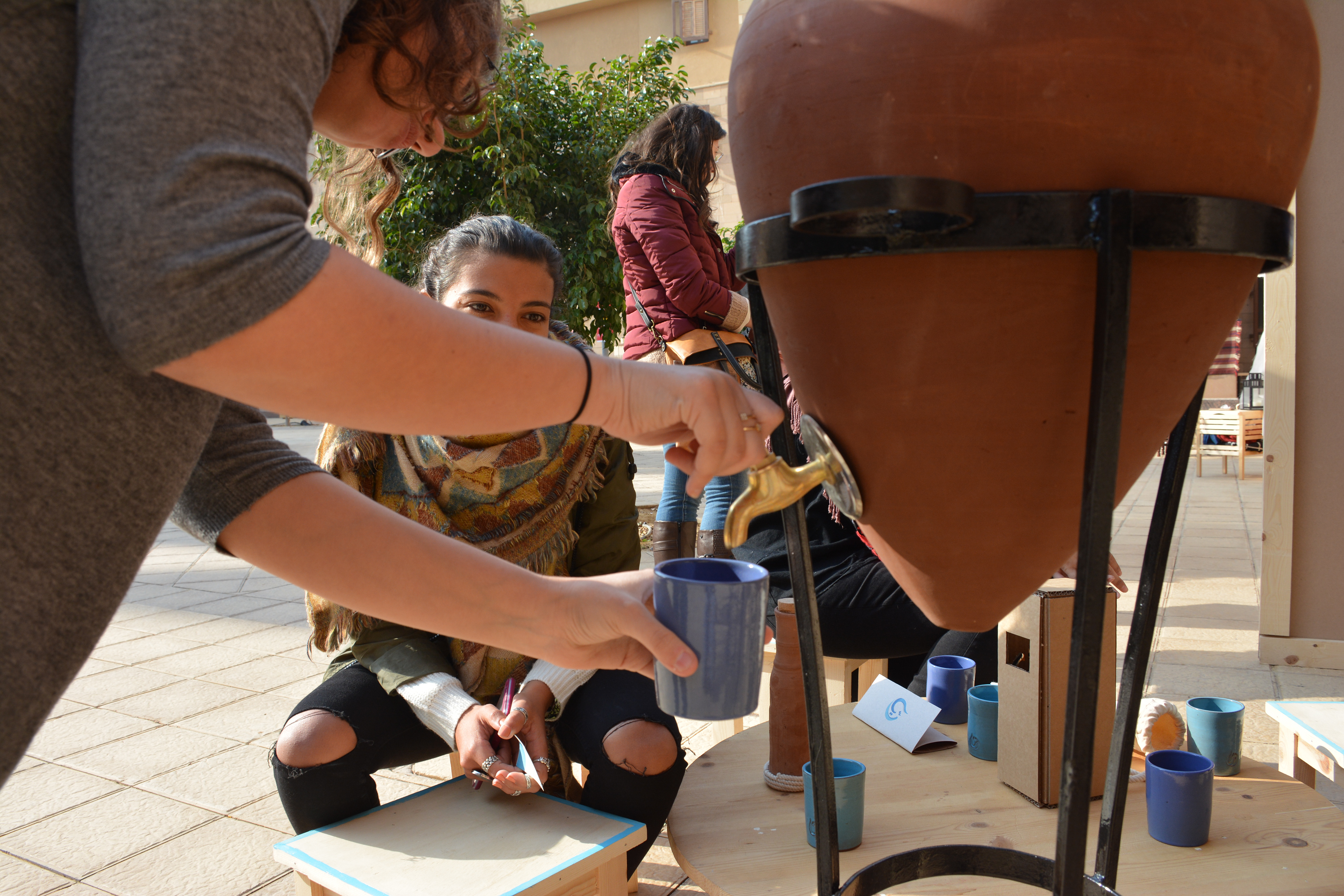
The "zir"--large pottery water container--was modernised to be easily used with the addition of a faucet and a cover for the top.
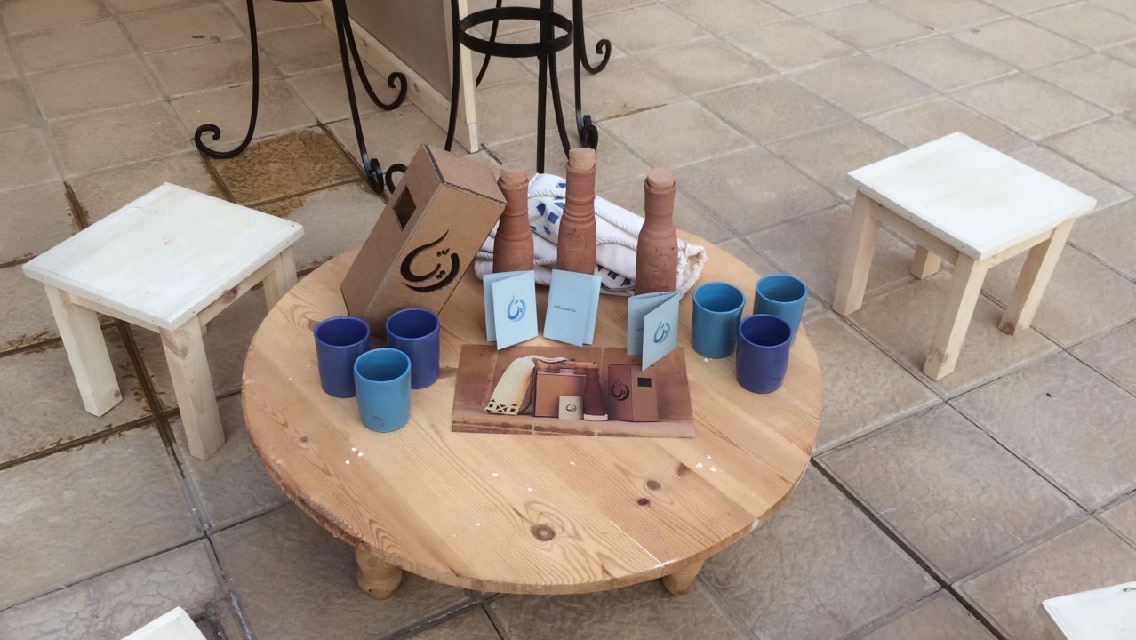
Rayya's range of products with their packages.
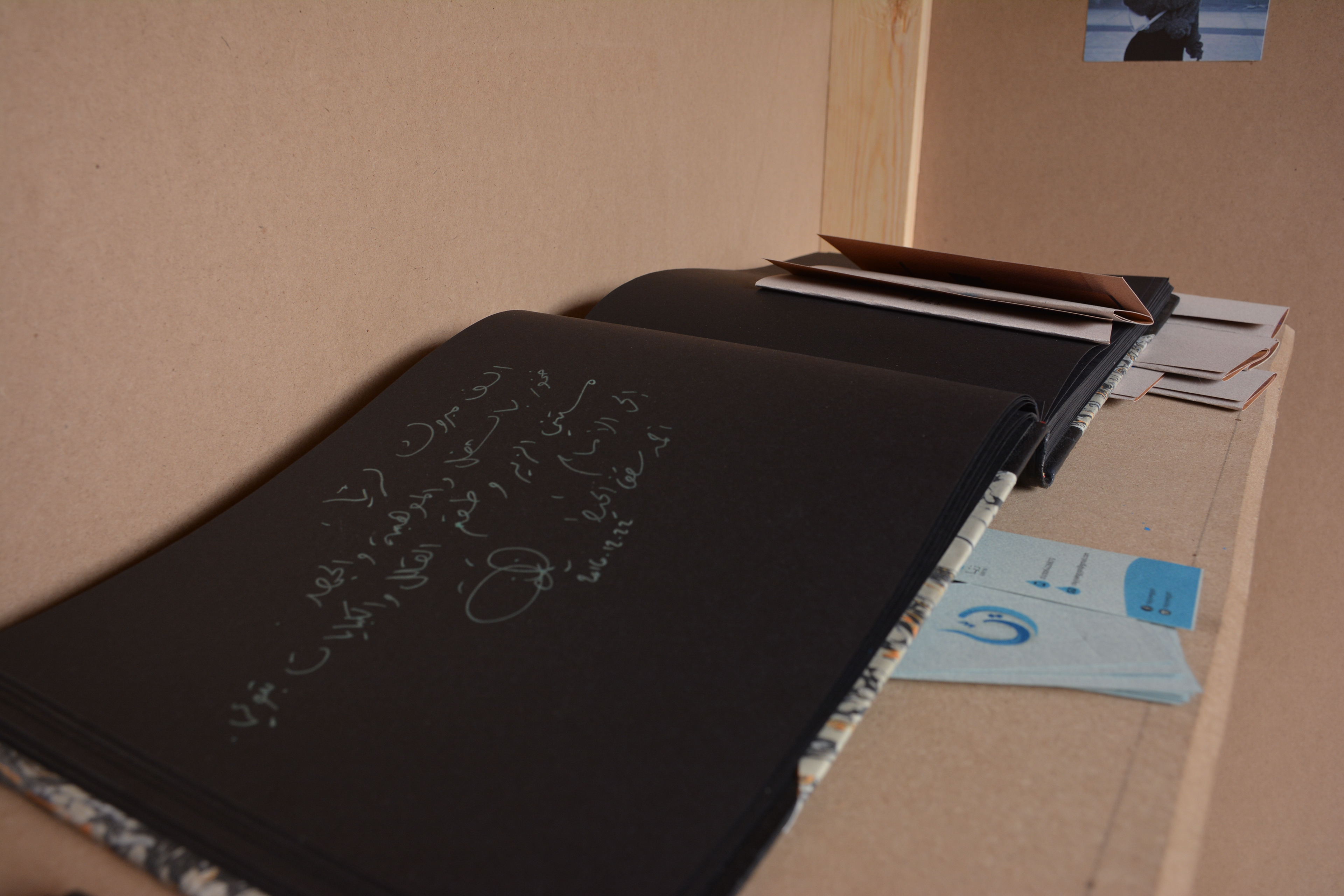
A guest book was put in the shop for visitors' feedback.
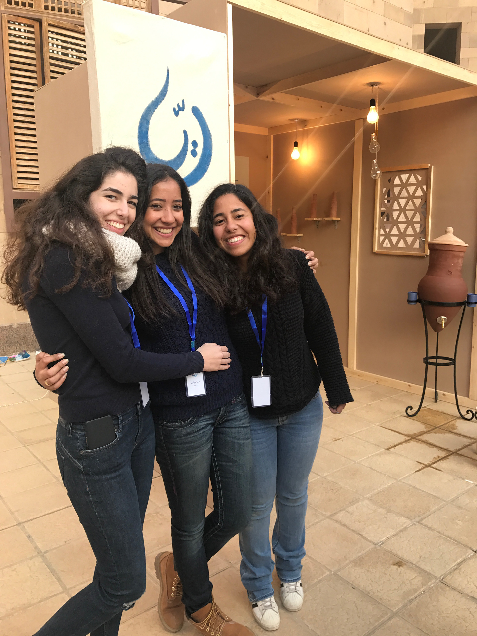
Rayya's team members: Alya Mosharafa, Sama El-Beltagy, Lama Abdel Wahab (from left to right).