a unique perspective on Cairo's vernacular design
Habashtakanat magazine is a graduation project researched and produced in the span of one year under the supervision of Dr. Bahia Shehab.
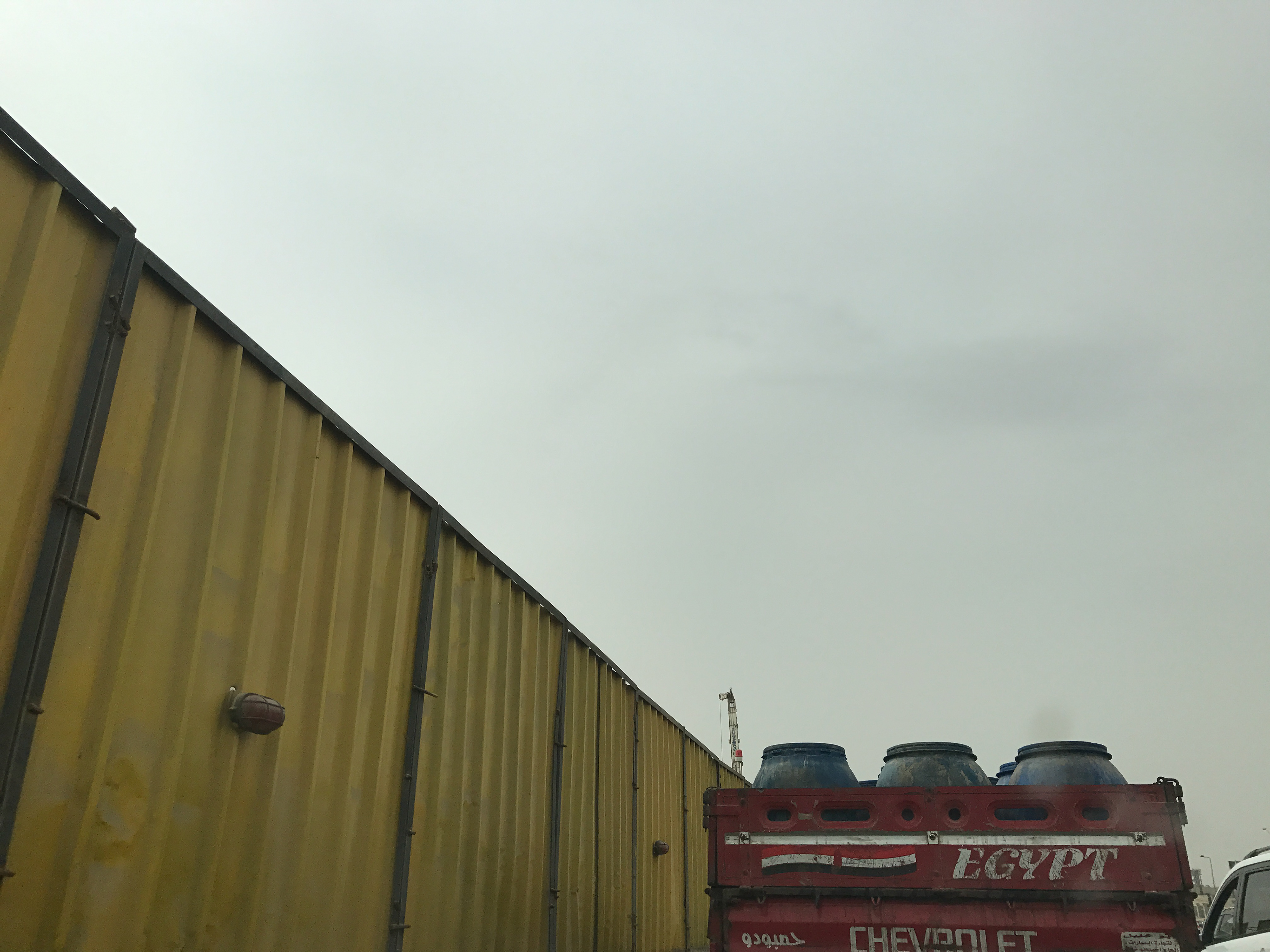
How it all started...
Cairo is the city I grew up in. My love for this city is equal to my hate for it: living in it can be overwhelming, yes. I couldn't agree more when my professor told me once that in order to be able to live in it, you have to get away every once in a while...
I cannot say that I've been everywhere within its boundaries but what I can say is that I've walked enough in its streets to notice how visually rich they are. When this notion struck me, I couldn't overlook the layers I found in every street I walked in and it dawned on me how heavily influenced we local designers are by its content. And so, I kind of felt a responsibility towards this emanating flow of hazardous inspiration and the need to document it in any way possible before the urbanization movement comes along and destroys everything that is truly Cairene about Cairo...
Project Description
This project attempts to preserve the visual inspirations found on Cairo’s streets through documenting them in a magazine whose design reflects their style and the way they are positioned within their environment. It entails the study of the language of the street and the hidden layers within it. Consequently, tapping into what it can offer and representing it in a similar undertow.
The project’s main aim is to contribute to the city’s visual language and culture. Not to mention putting into view a not-so-often noticeable portrait of the city—a map of Cairo—using a micro dimension; as per the words of Franco Moretti in the Atlas of the European Novel, “because a map is precisely that, a connection made visible—will allow us to see some significant relationships that have so far escaped us.”
The magazine is produced in simplified Arabic language. All the photographs used in the collages are taken by the designer. The same applies for the anecdotes which are written by the designer based on inspiration from the nature of the Cairene streets.
About the Magazine
Habashtakanat is a magazine that attempts to document the makeshift solutions that people create instantaneously in order to overcome the misfortunes and difficulties they face daily on the streets of Cairo. The magazine’s main aim is to contribute to the city’s visual language and culture; as well as trying to attract people’s attention to a layer within our streets that we do not notice often. A rich layer of temporary inventions that reflects the creativity of their makers. Not to mention their fairly good exploitation of the resources they stumble upon in the street.
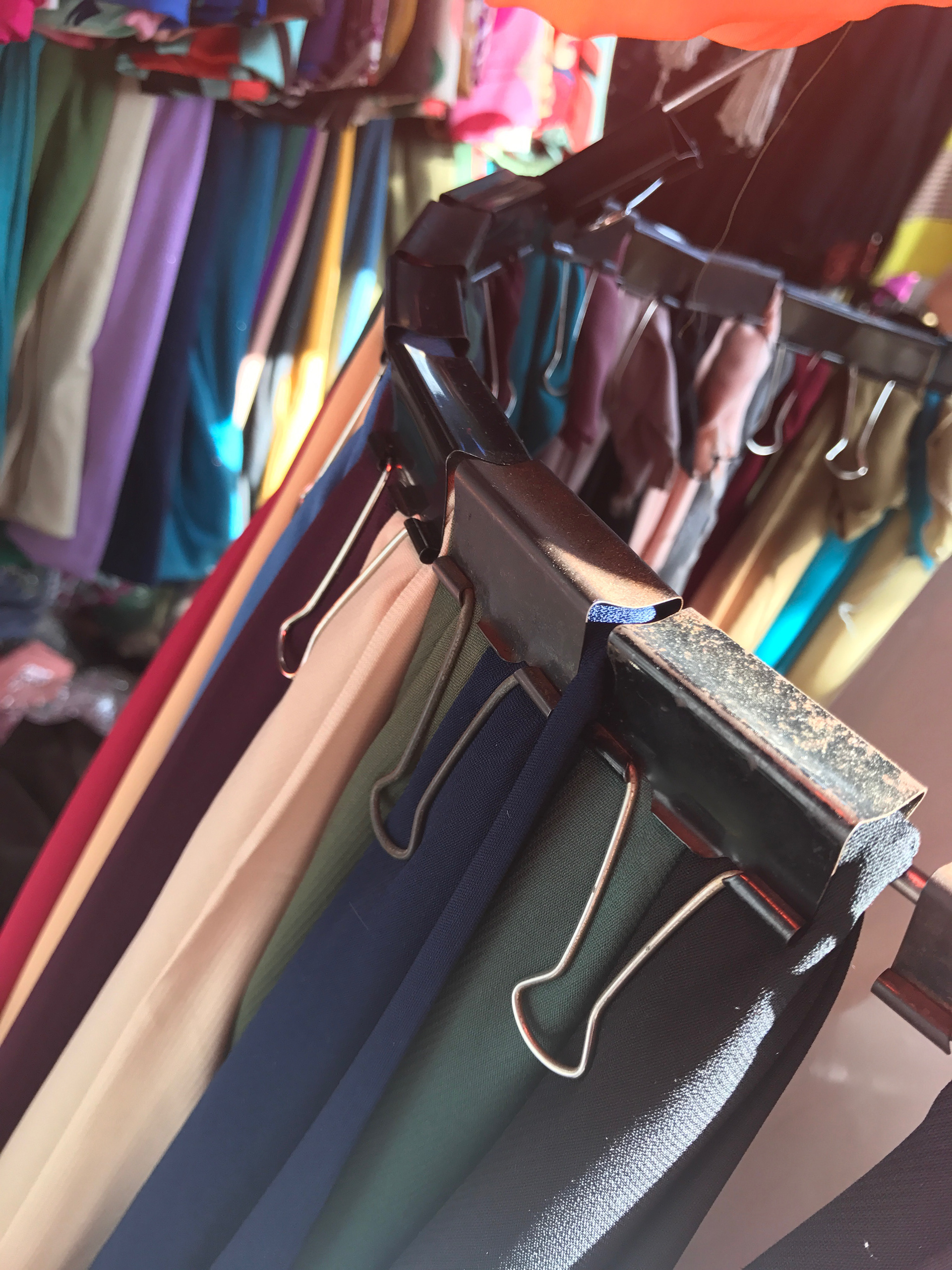
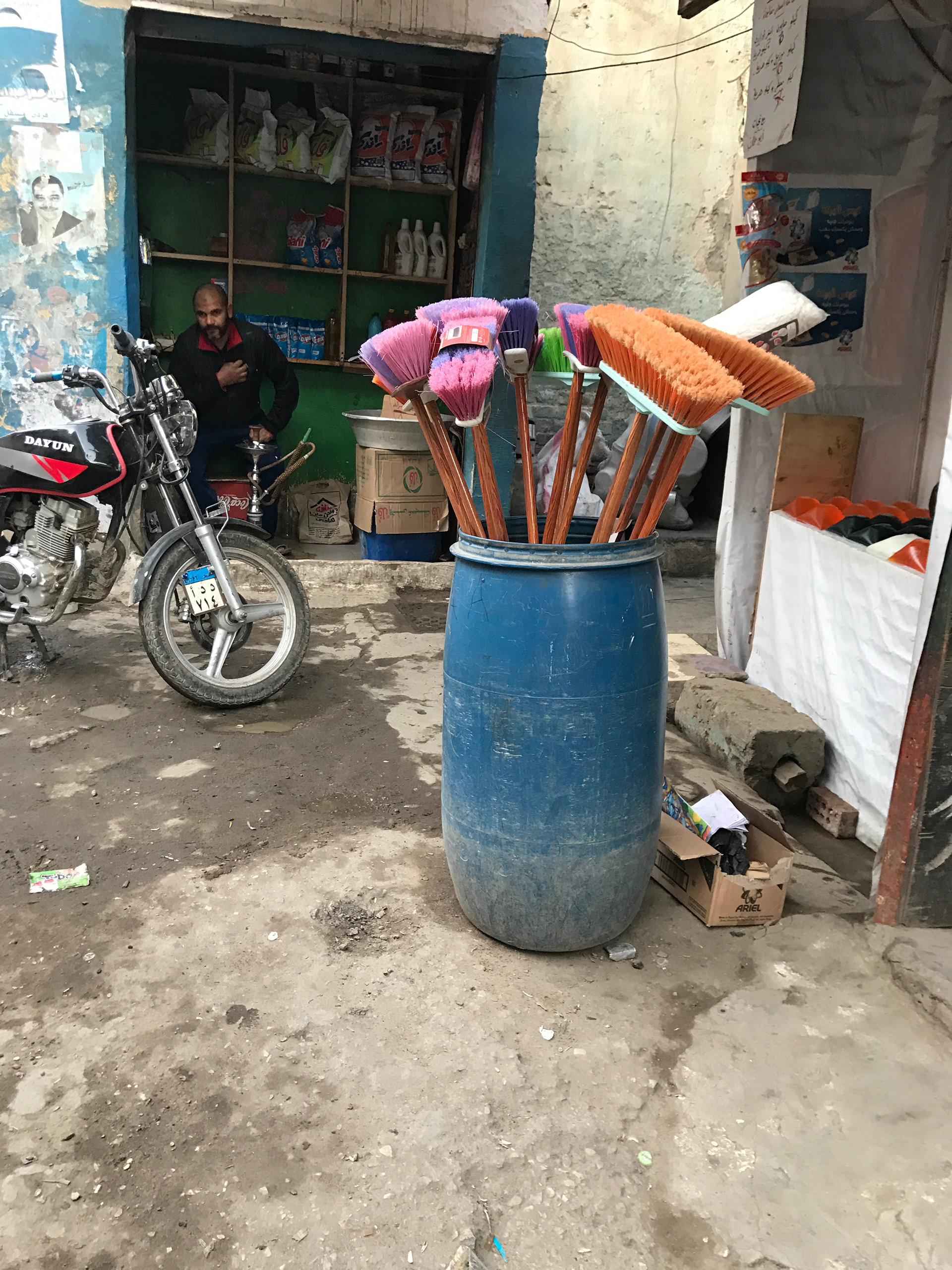
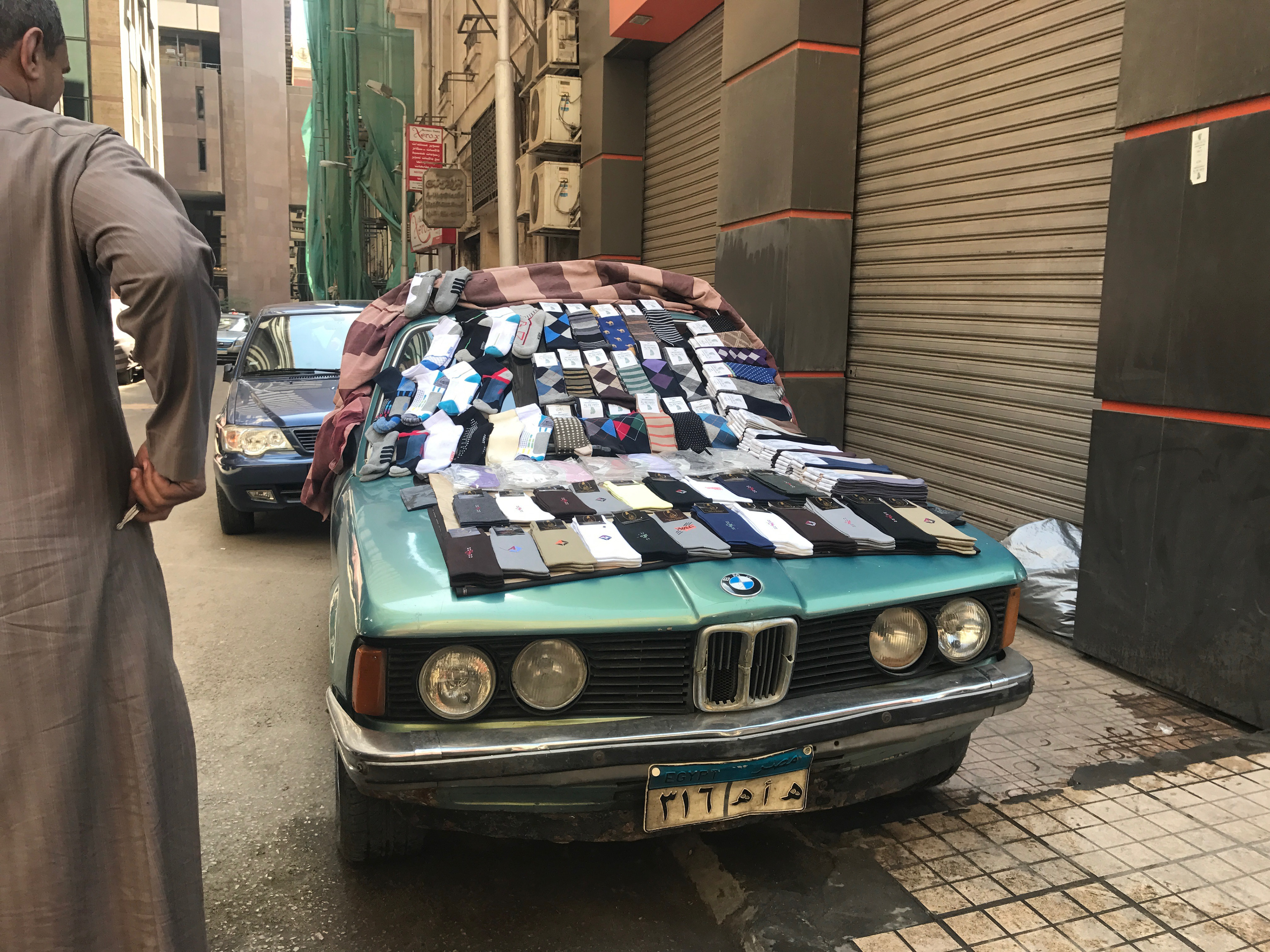
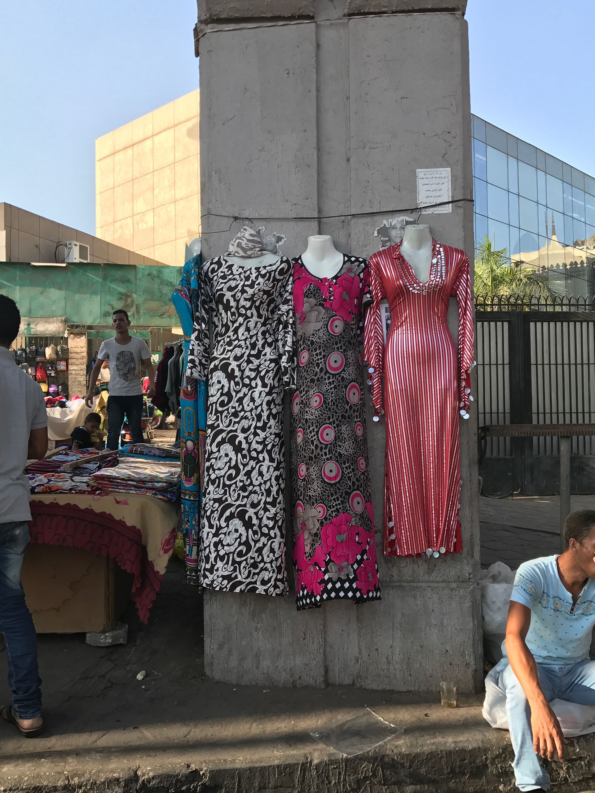
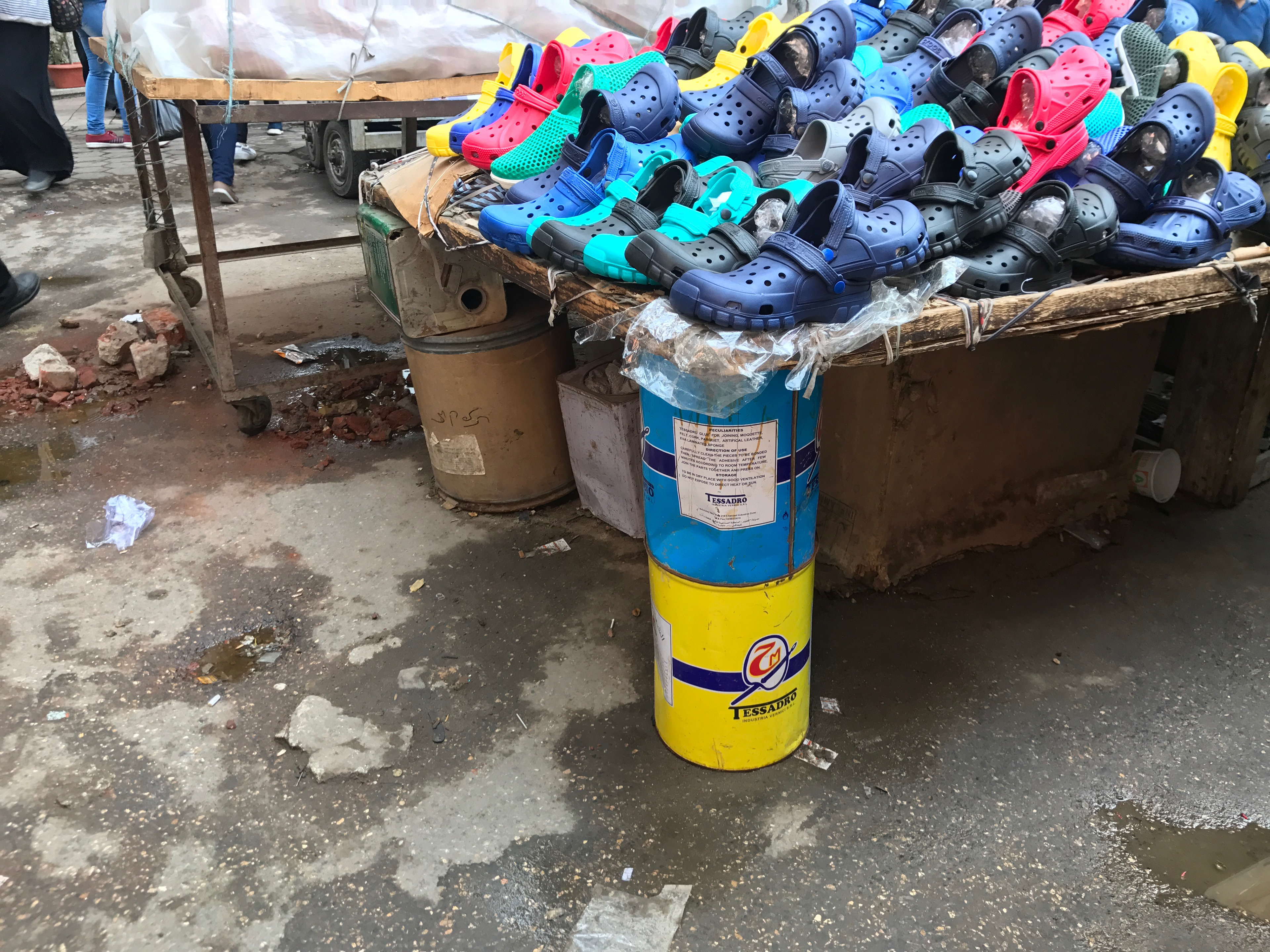
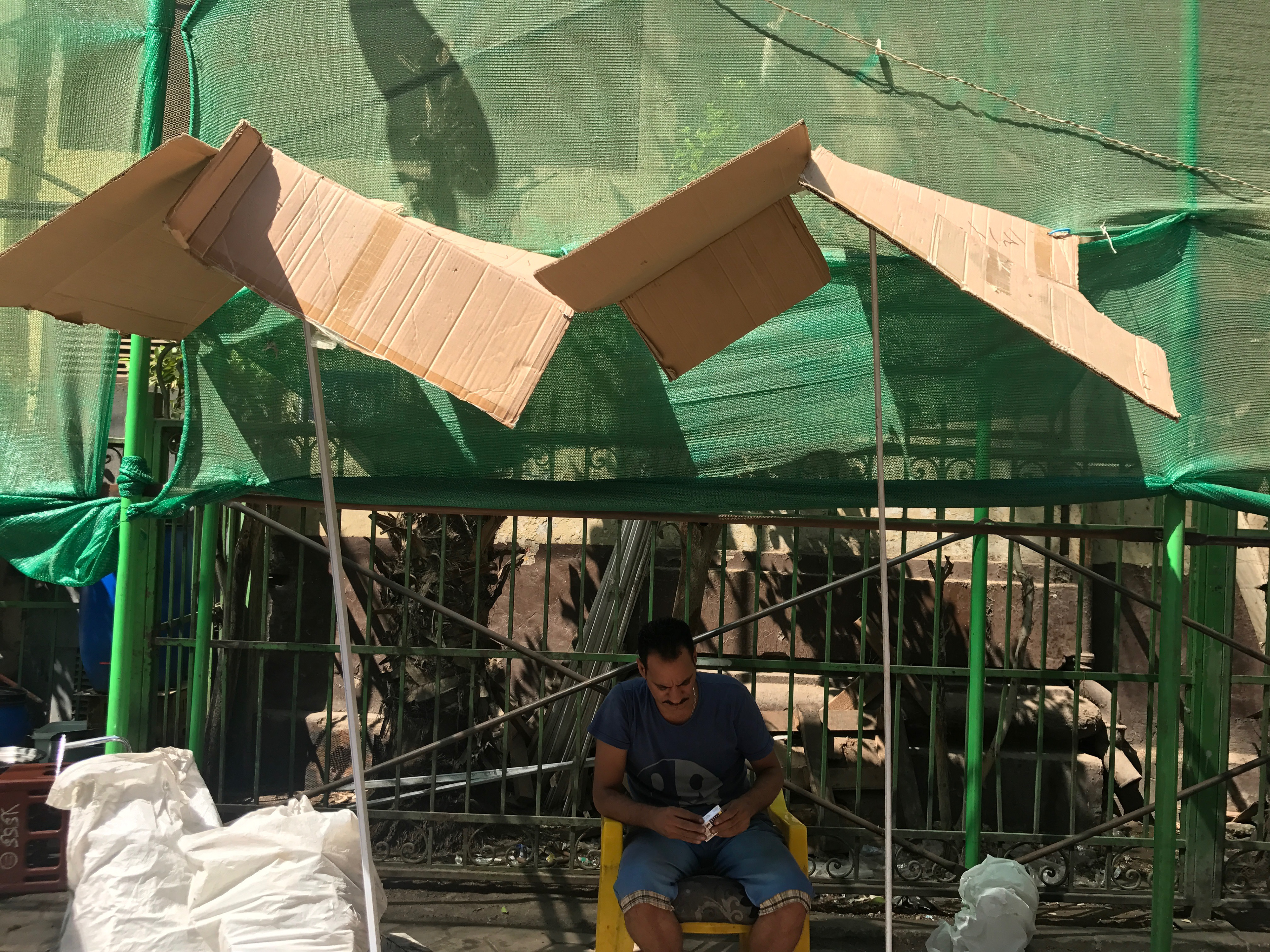
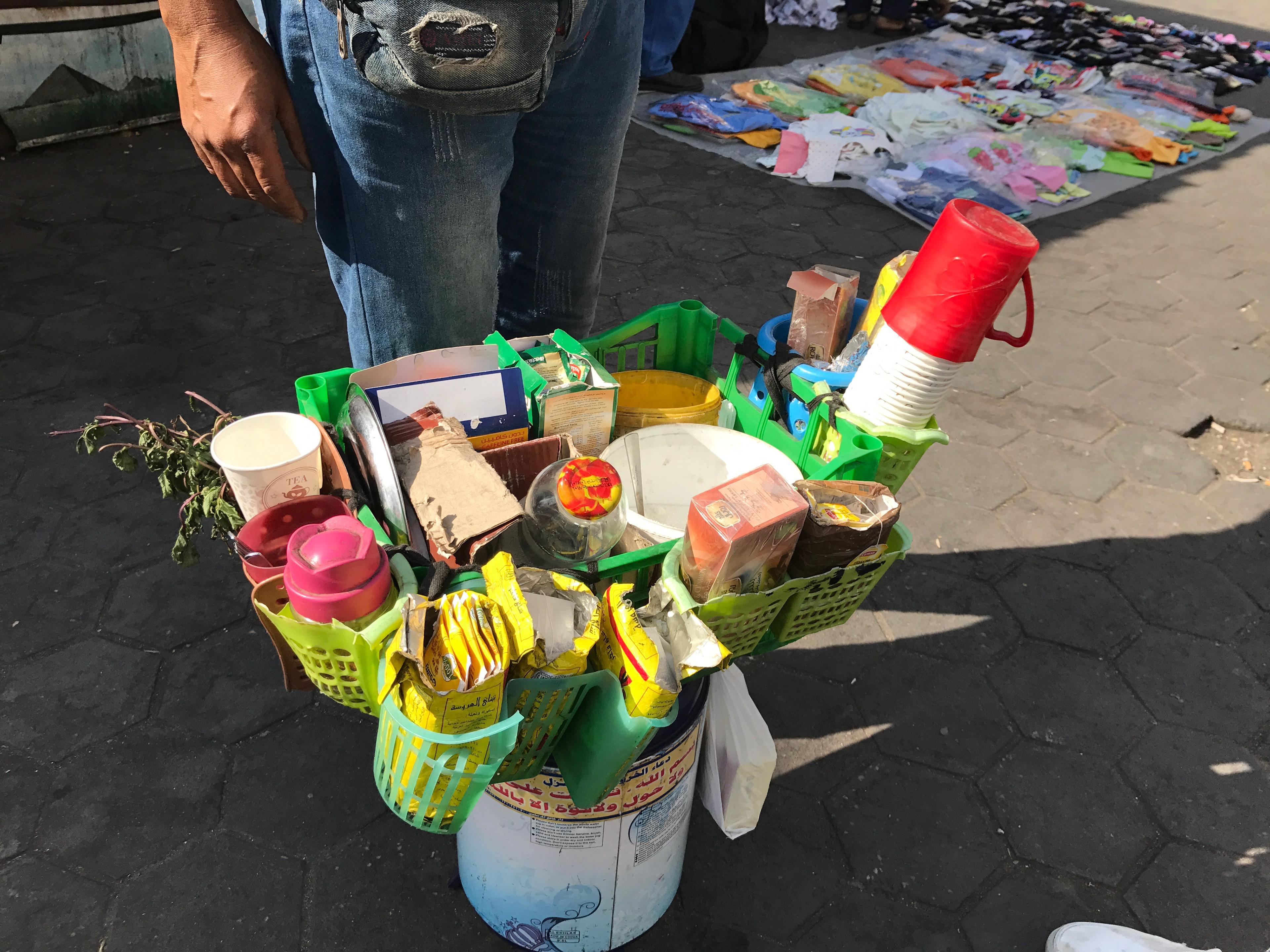
Throughout the magazine, there’s a focus on a number of different visual phenomena and elements that showcase the way people take ownership of their streets. It highlights in some how they repurpose the objects they find; and in others how both—the people and the inventions—adapt to the turbulent and constantly changing nature of their environment. And consequently, how all of these things add up and make the Cairene street what it is.
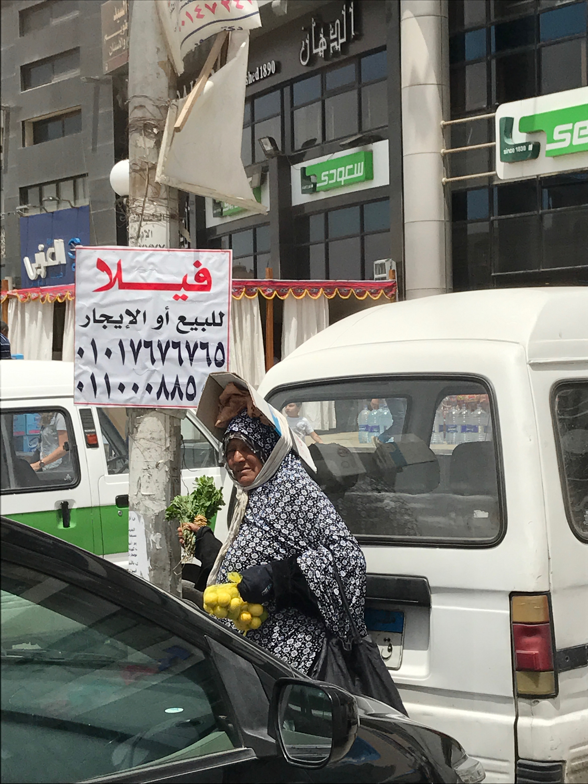
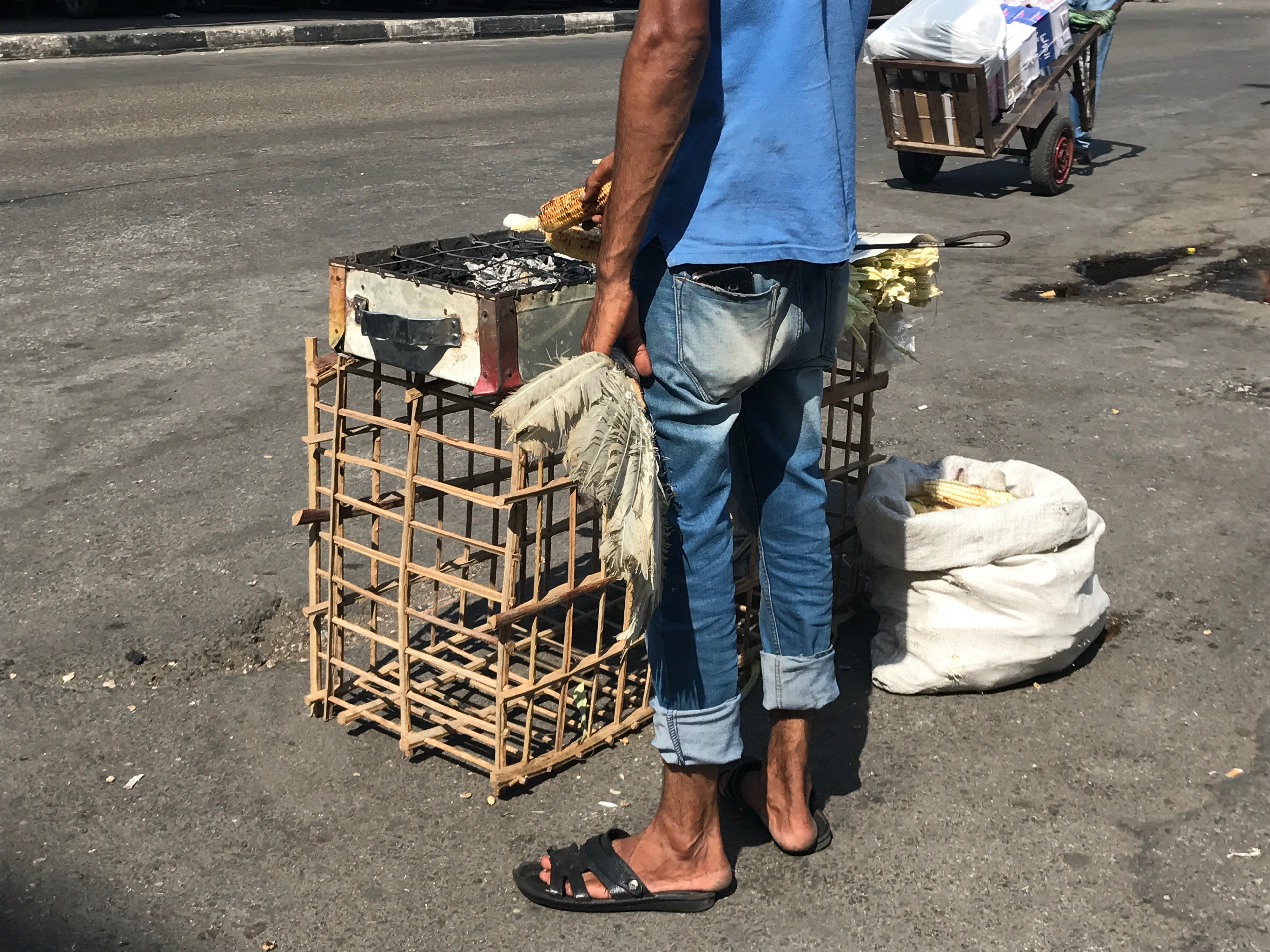
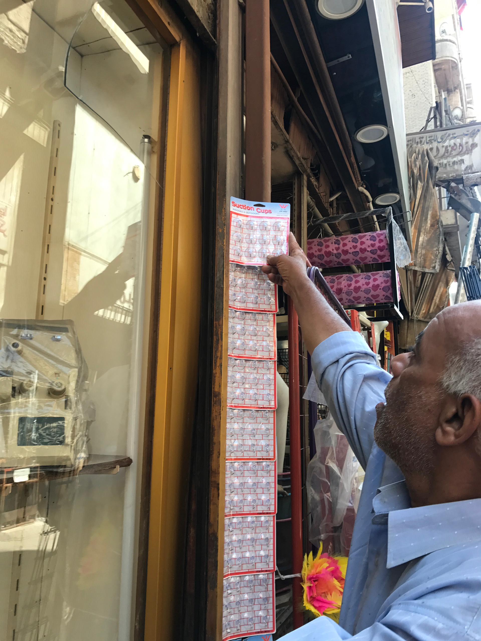
The magazine is designed in a way so as to depict this specific layer within the Cairene street. Its grid is dictated by the layout that the pictures when mashed up together, give birth to. It is mainly consisted of photographs taken in different areas around Cairo and brief anecdotes directed for more understanding for the reader.
The magazine's logo
The name "Habashtakanat" was chosen for how well it captured the essence of the temporary inventions. Basically, "Habashtakanat" is an Egyptian invented word whose meaning is defined by the context it's mentioned in; in other words, it adapted to it--same way as the inventions did with the streets.
The logo took on the word "habashtakanat" in Arabic lining it with a corner of the page as if normally being written--as in horizontally--and then adapting to the confinements of the page made this smooth vertical turn to the lower extremity. It's elongated using kashidas. The icon at the bottom combines the sun for intellectual illumination and the open eye for enlightenment through sight.

The short description goes as follows: "Habashtakanat is a magazine that aims to document the temporary solutions that people resort to in their daily life across different areas in Cairo as a way to preserve the city's visual language and culture."
The magazine's slogan: "An unusual magazine about makeshift solutions."
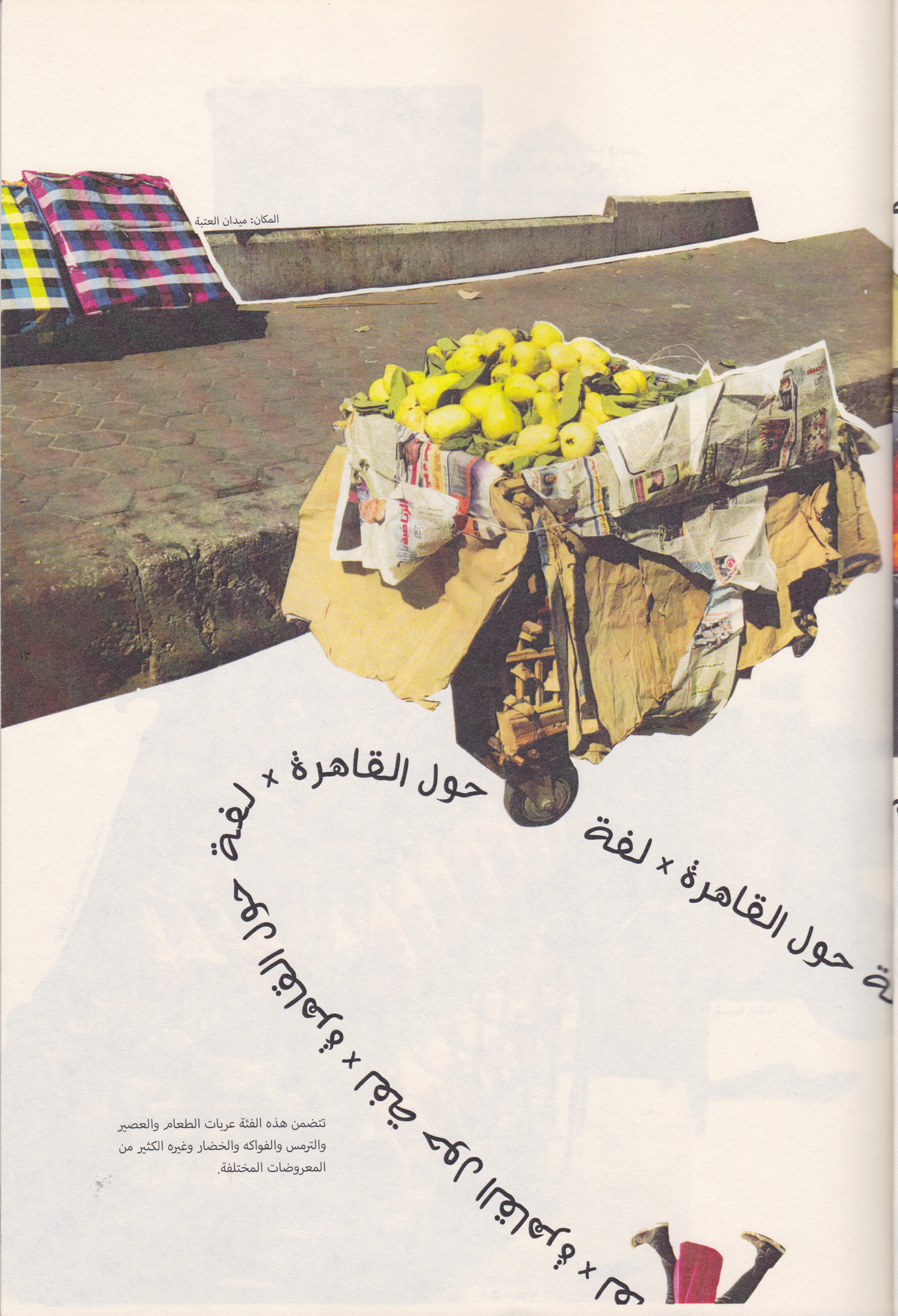
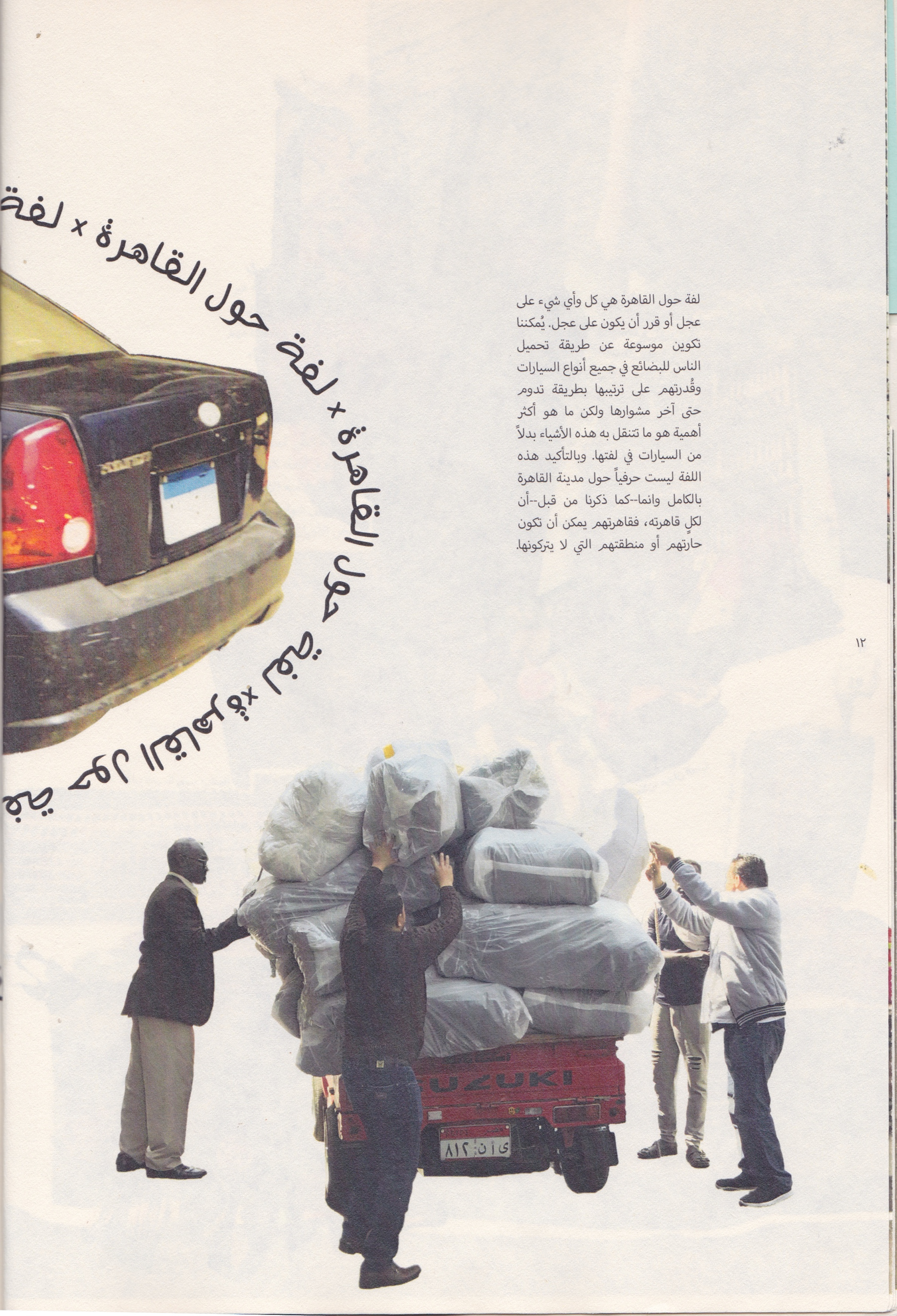
A spread from the magazine's first issue showing the start of "Cairo on Wheels" section involving all objects that move around the city or are redesigned to do so
The idea was to create a unique magazine with a unique layout. It seemed that mirroring the identity of the street would have entailed a chaotic manifestation of info complemented by the images collected; however, this wasn't the intention. The magazine's main aim is to attract people's attention to phenomena and elements scattered around the streets that they don't notice often; therefore, it had to depict the hidden layers in which these elements lie and bring them to the surface.
All design materials follows two statements: 1. adaptation to the chosen medium with all its properties just as the people adapt to its unpredictable nature; 2. The layout and the grid of each spread or page is dictated--rather 'imposed'--by the mashing the pictures together give birth to.
The First Issue
Different prints of the first issue
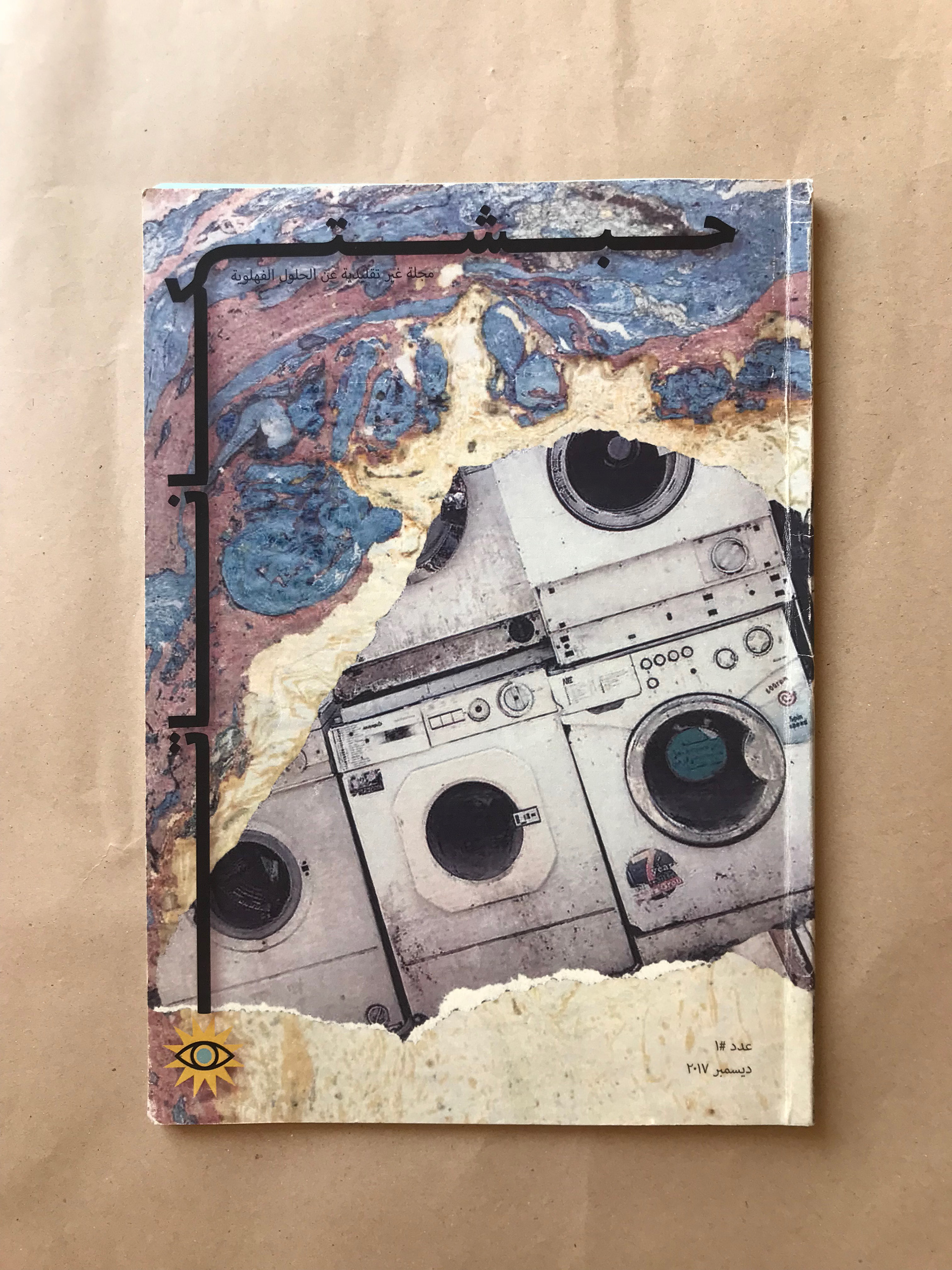
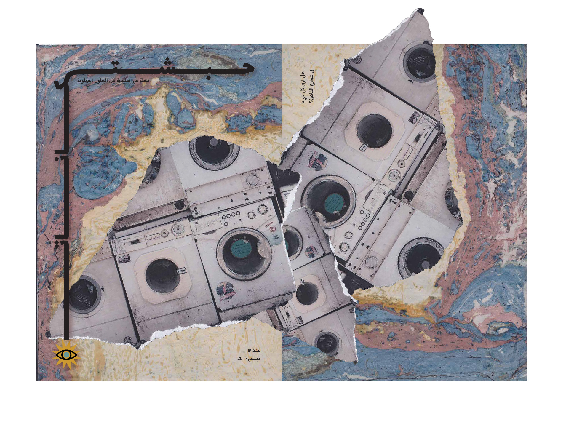
The cover was a collage made out of a base of marble paper and a cutout of a photograph. Both materials were used to show how the present is always in flux, temporary as the nature of the inventions
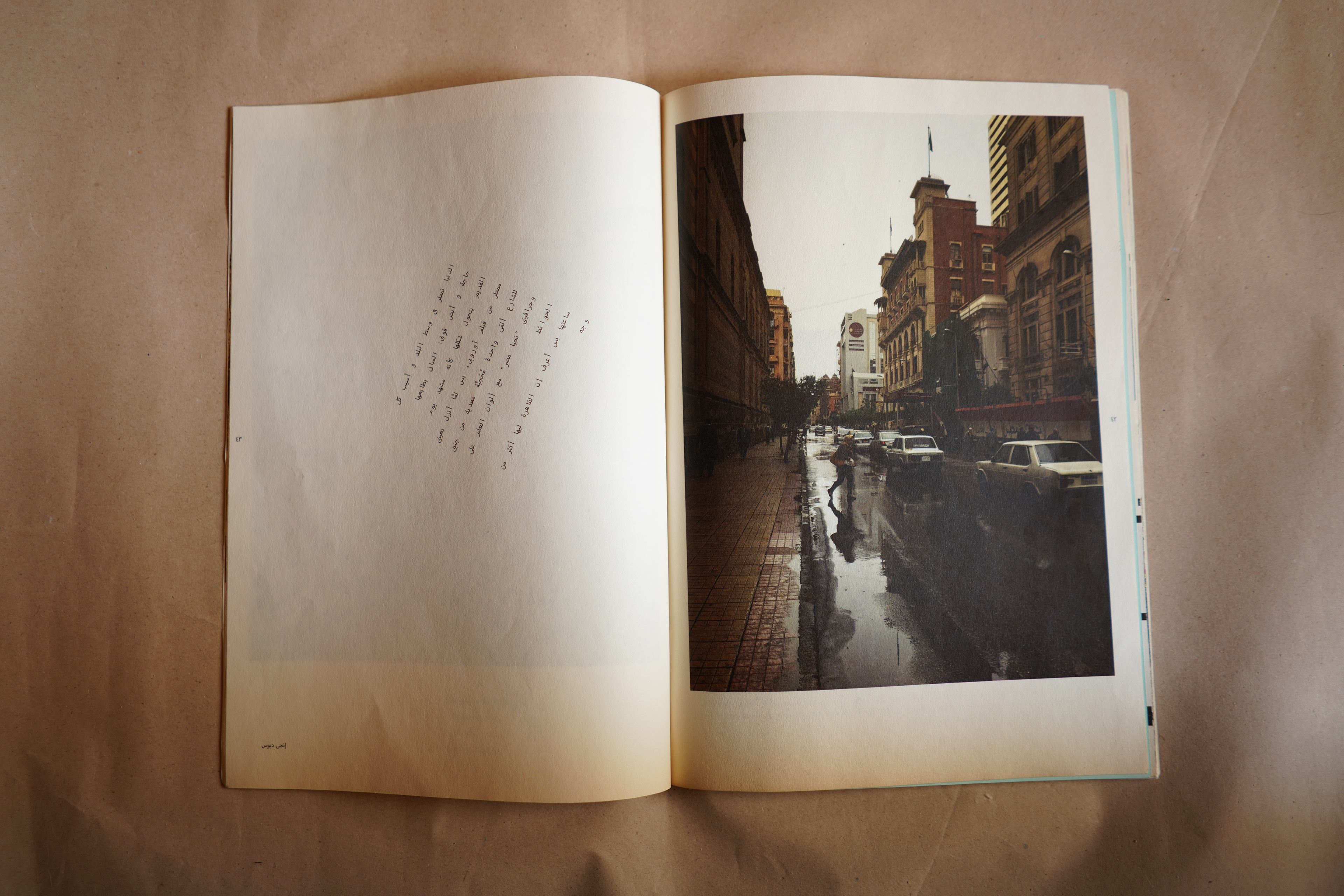
Details from "The Series of Cairo the City of...;" a section based on open submissions in the form of text and images describing how different people express their relationship with the city.
Managing one of the cutouts...Flipping through it, you'll get this message from the editor in the front: "There's no history without documentation." and this one in the back: "What we see controls what we don't see."
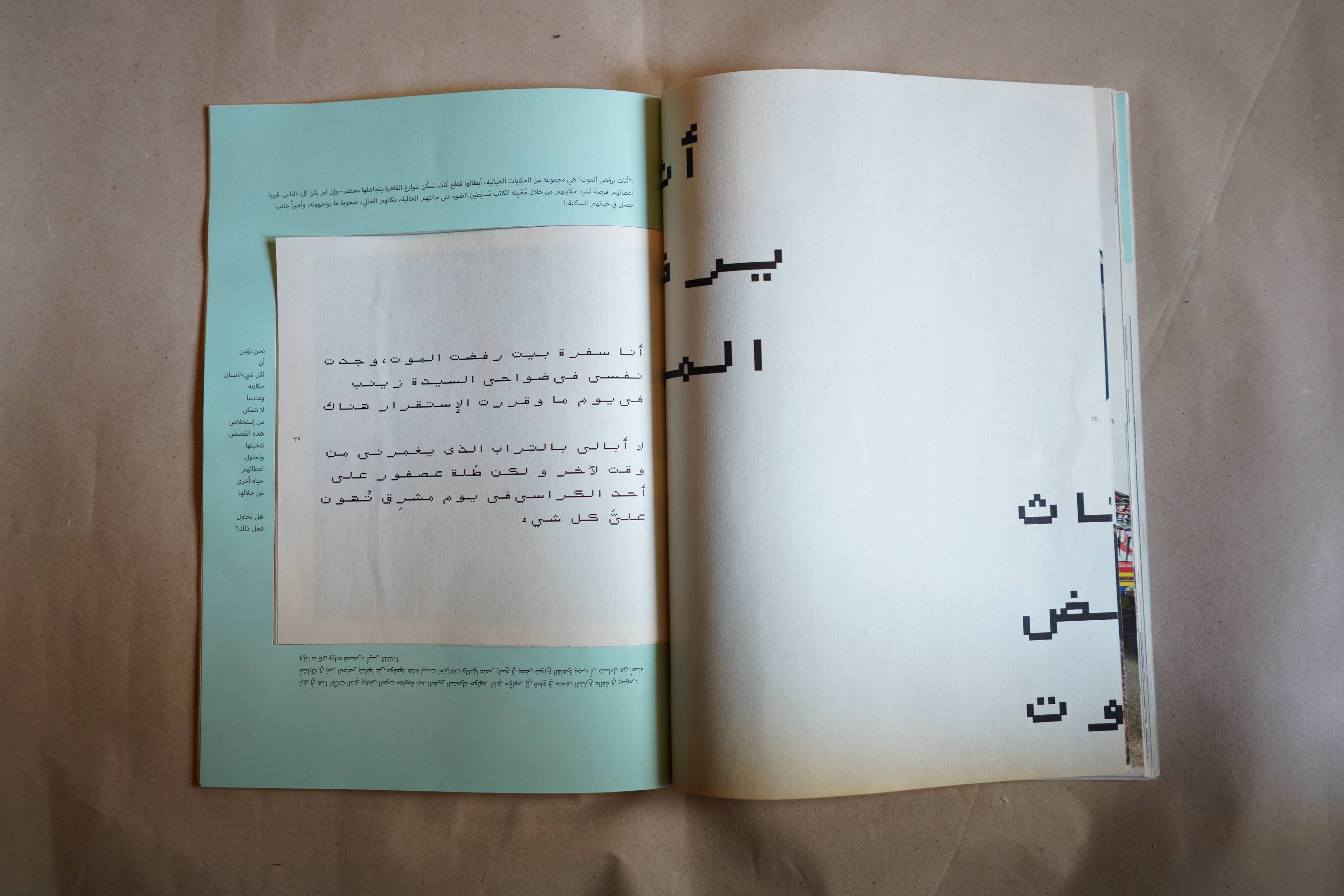
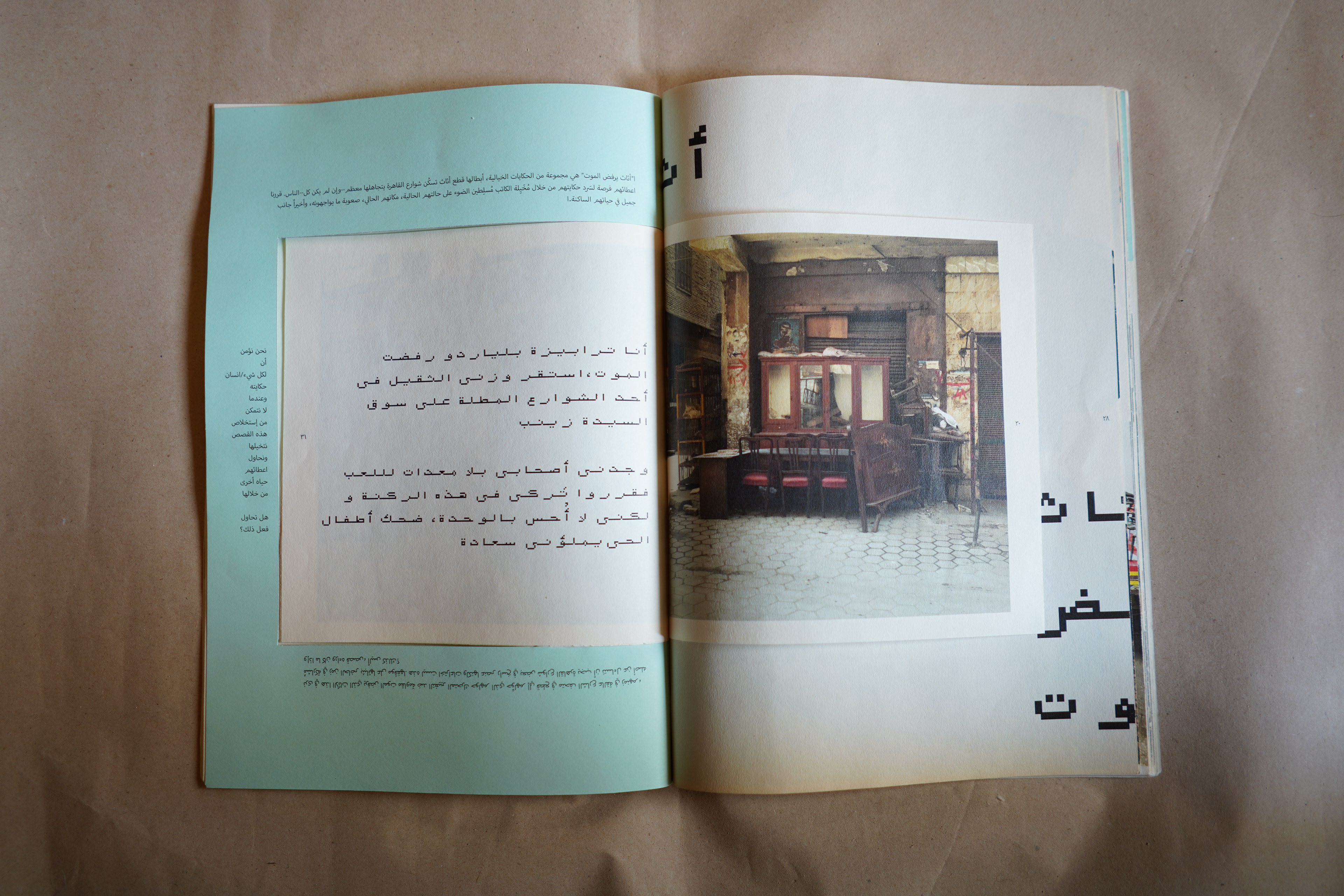
A spread showing how to flip through the mini series of "Undying Furniture" which is centered on stories giving a voice to furniture lying around the streets, refusing to die.